Portale del Cittadino
Milan's Citizien Online Platform
Developed with
Timeline
April 2023
July 2023
My Role
Desk Research
User Research
UX Design
User Testing
Video Editing
Concept Pitch
Tools
Figma
Maze
After Effects
Summary
This project was developed during the Digital Design Studio course with Comune di Milano as the primary stakeholder. In fact, the project aim was to use every methodology learned in the course in a real-life scenario with a real client.
Brief
The objective is to analyze and re-design both the website and the app of Milan’s “Fascicolo del Cittadino”. You can expand the existing platforms by adding and/or connecting new services of the Municipality of Milan so that it can connect citizens to further services - apart from those connected to the civil registry.
Outcome
A complete analysis and redesign of Milan’s online platform with a new naming, user experience and interface.
Research & Analysis
A comprehensive understanding of the 'Fascicolo del cittadino' was achieved through extensive primary and secondary research. The research involved in-depth analysis, user interviews, and usability evaluation to gather valuable insights. Secondary research complemented the findings, providing a well-rounded perspective on the topic for informed decision-making and effective solutions.
What is the Fascicolo?
The Digital Citizen Folder is a tool provided by the Municipality of Milan, currently available as a web and mobile app, designed to provide convenient services to the citizens by enabling quick and personalized communication between the administration and residents.
Digital Transaction
The platform enables digital transactions such as scheduling appointments, making payments (including fines), reporting complaints, and requesting assistance.
Personal Repository
The platform serves as a personal repository for citizens' data and documents, including vital records and voter registration cards.
Desk Research
Website
The website version of the ‘Fascicolo del Cittadino’ is accessible within the online services on the website of the Municipality of Milan and it’s characterized by the division into 11 types of available services.
Additionally, it is possible to monitor appointments with the municipality, check pending payments, and track deadlines.

Application
The 'Fascicolo del Cittadino' application has been developed to leverage the potential of mobile platforms. Available for download from the major app stores, it offers a streamlined package of services compared to its web version. Specifically, the services are divided into five categories: personal data, mobility, a map for locating key offices and services, properties, and payments.
Additionally, the app provides the ability to access real-time communication and utilizes the push-notification system to keep the user updated.
Existing Solution Insights

Benchmarking
International case studies
To gain insights for an improved redesign of the "Portale del Cittadino," we conducted a comprehensive benchmarking analysis encompassing both Italian and international cases.
Regarding international institutions, we examined the websites of Paris, London, Madrid, and Zurich.
Where accessible, we delved into the personal areas of citizens to evaluate the services provided, their hierarchical structure, and the type of information available. Among the sites analyzed, the municipality of Paris stood out, characterized by its clear and straightforward categories that facilitate easy navigation and swift access to desired content.

Italian case studies
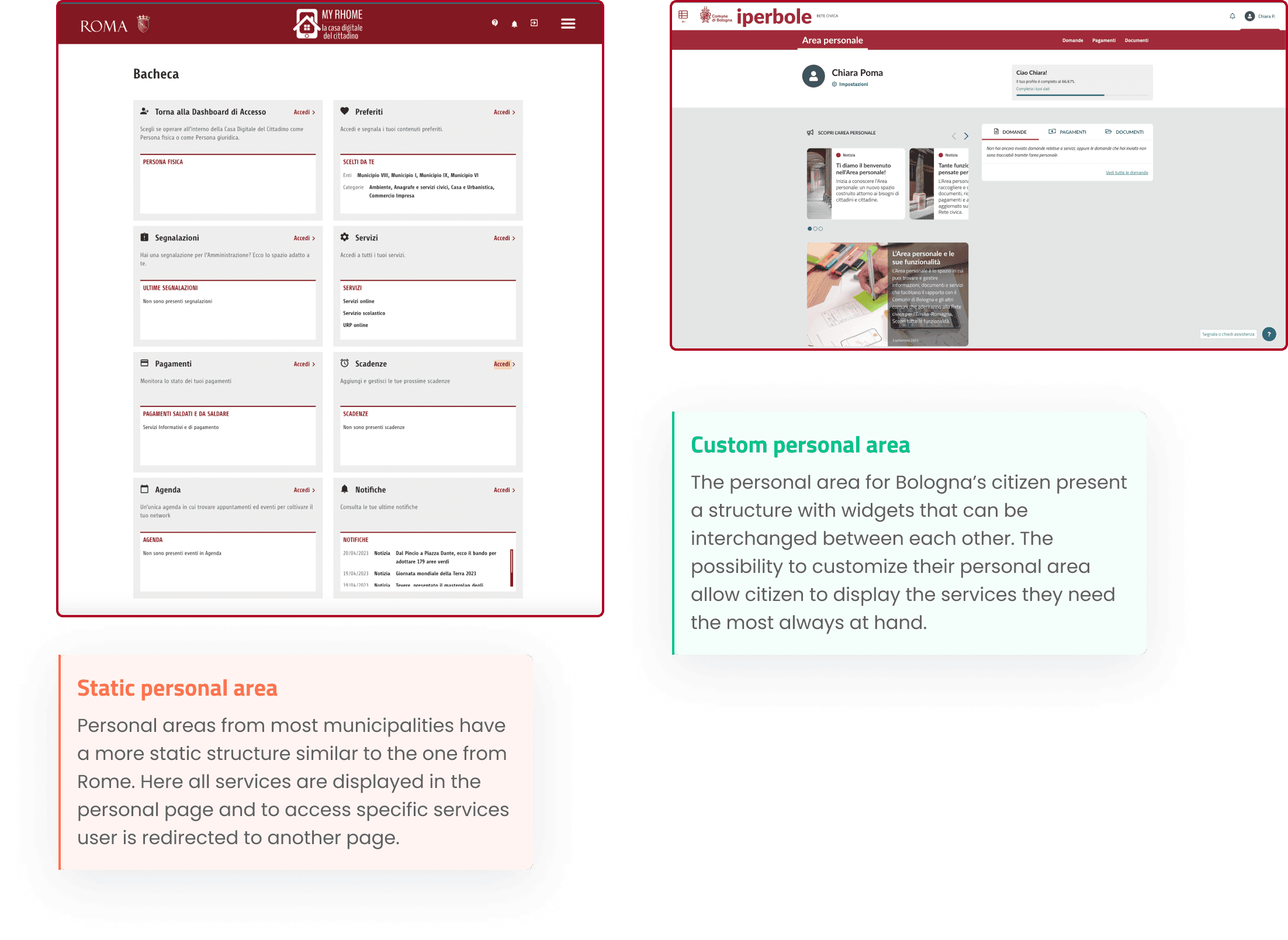
Within the realm of Italian institutions, we scrutinized the websites of Bologna, Turin, Ravenna, Monza, Florence, and Rome. It emerged that not all cities have an exclusive personal area for citizens, and none of the Italian municipalities considered had developed a smartphone app granting access to web-based services.
Notably, the Municipality of Bologna exhibited an intriguing case, featuring a simple yet highly intuitive website structure. The sections were aptly named, ensuring immediate comprehension. The website encompassed a general section dedicated to citizens as well as a personalized area where citizens could autonomously customize and manage available services.

Benchmarking Insights
The analysis revealed that the prevailing practice involves organizing services within a designated page in the main menu. However, these services are often presented as a basic alphabetical list, posing challenges in locating specific services despite the presence of a search bar. Additionally, the naming of these services tends to be complex and fails to accurately reflect their intended purpose, impeding targeted searches within the lists. A more effective approach, as exemplified by the Municipality of Bologna, entails grouping services into thematic macro-areas, facilitating the identification of specific services within relevant categories.

Another crucial finding pertains to the personal area of citizens. In the majority of cases, this area was found to be static and lacking customization options tailored to individual needs. Primarily functioning as a hub, it provides access to. Another crucial finding pertains to the personal area of citizens. In the majority of cases, this area was found to be static and lacking customization options tailored to individual needs. Primarily functioning as a hub, it provides access to specific services that are utilized on a needed basis. This discovery could explain the lack of a mobile app, because if access to services is rarely required, an app would prove to be of little use to the citizen.
User Survey
Survey Structure
To gain deeper insights into the usage patterns of ‘Portale del Cittadino’, we conducted a survey targeted at Milan citizens who are regular users of the service.
The purpose of this survey was to gather valuable feedback directly from the users themselves, enabling us to better understand how they utilize the “Fascicolo” and their overall experience with the service. The survey was strategically distributed across various social channels to ensure a diverse range of respondents.

Survey Results
The responses obtained from the survey provided gave us diverse range of perspectives regarding the overall experience of using the website and application. We collected valuable feedback from the survey, with a total of 31 respondents.
While some users expressed satisfaction and did not have specific complaints, others voiced their struggles, highlighting usability and navigation issues on both platforms. A notable observation was that the majority of respondents reported using the application only on specific occasions, with its usage primarily limited to tasks such as paying fine tickets. This indicates that the application's utility and range of services are perceived as limited compared to the website.

User Interview
Interview’s purpose
After collecting initial feedback, it became apparent that conducting direct interviews with some users was necessary, as the feedback received was varied. To address this, we reached out to five individuals who had previously expressed their willingness to be contacted through the survey.
We structured two separate interviews, one for those who responded positively to the survey and another for those with negative responses.
While there were specific questions tailored to each group, there were also common questions asked to all participants to gather a comprehensive understanding of their experiences.

Interview Insights
Design Issues
Design Opportunities

Heuristic Evaluation
We conducted an heuristic evaluation of the 'Fascicolo del cittadino' to assess its usability and identify areas for improvement. By applying established usability heuristics, we aimed to uncover design issues and enhance the user experience.
After setting the objectives and select tasks for the analysis, each member of the team performed their own heuristics evaluation while adopting the user’s mental model for the achievement of each tasks. In order to choose and validate consistency of any identified usability issues, the three experts eventually got a review session to produce a final evaluation.
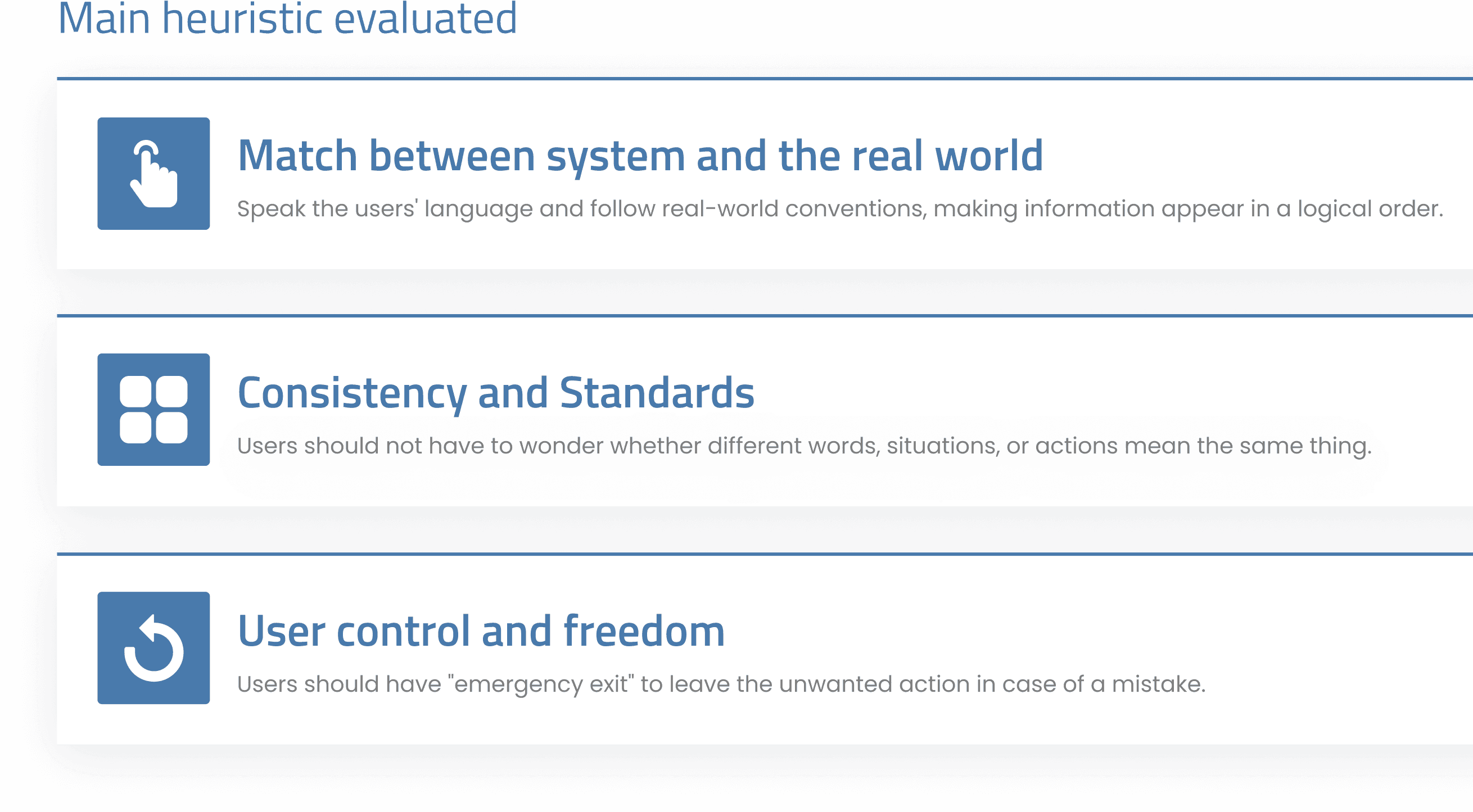
Match between system and the real world
The menu structure deviates from conventional standards, as some services are not readily visible
The tab containing recent notification and deadlines is not fixed on top and it’s not visible after selecting a service
Informations are not located inside their correct place


Consistency & Standards
The services button are not clickable (only the text works as a button). Additionally, the buttons do not have an hover state.
Secondary buttons have a misleading affordance

User Control & Freedom
It is not possible to pay tickets through the website
It is not possible to go back to the start after selecting a service

Redesign
The redesign process for the Fascicolo del cittadino involved a comprehensive approach aimed at enhancing the user experience and accessibility of the service. A mid-fidelity prototype was developed and usability tests were conducted to validate design decisions. The focus of the redesign was on optimizing service organization, introducing personalized features, and improving the wayfinding experience. Following a mobile-first approach, compatibility across different devices was ensured, including a web app, native app, and desktop version.
Goals
Expand Service Accessibility
Services within the "Fascicolo del cittadino" are currently only accessible to residents of Milan, excluding non-resident individuals who work or study in the city. This limitation needs to be addressed to make services available to a broader audience.
Proactive Approach
Our redesign approach aims at anticipating and addressing user needs and challenges by showing the services and news related to the user’s interests as well as giving the possibility to personalize their experience.
Enhance Communication
Facilitate citizen-municipality communication with accessible channels and responsive assistance to improve the support.
Improve Usability
Enhance system usability for the citizens by improving the user experience, simplify the interface, and optimize the accessibility.
Mobile First Approach
To provide a seamless user experience, we redesigned the Fascicolo del cittadino as a web app, native app, and desktop version. Firstly, by focusing on the web app, we ensured a solid foundation that could be easily adapted for both desktop and mobile experiences. This approach allowed us to gather valuable insights and feedback from users and municipalities at an early stage, refining the design, addressing usability issues, and aligning with specific requirements. Additionally, starting with the web app enabled us to streamline development efforts and ensure a consistent user interface across all platforms, fulfilling our goal of providing a user-friendly and adaptable solution.
Information Architecture Analysis
To achieve a more personalized citizen file and a significant redesign, a revised architecture for the Fascicolo was developed. This involved comparing the app and website with other municipalities' sites during the benchmarking phase to identify suitable services for integration and improve organizational strategies. Building upon the existing structure of the Fascicolo, which includes 10 macro sections, the departments were reorganized and necessary adjustments were made. Additionally, additional services accessed through the website's service list and commonly found on other municipalities' sites were included.
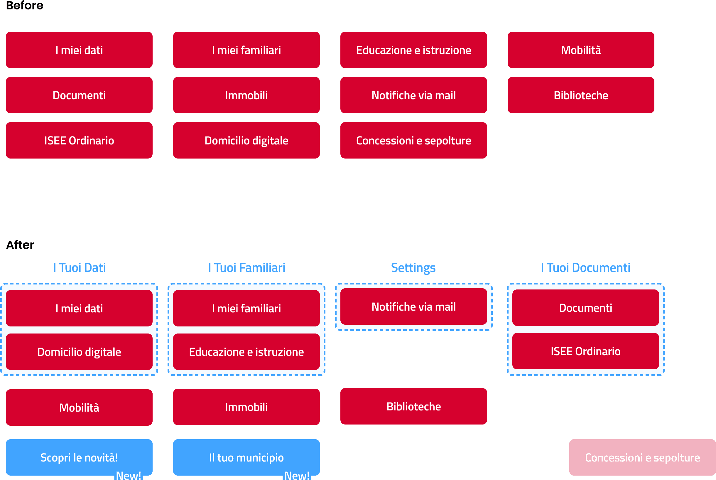
Hybrid Card Sorting
Categories Definition
After defining the new sections and their contents, a hybrid card sorting approach was employed. This method proved to be more suitable for our needs, considering the results obtained from the benchmarking analysis and interview phase. The hybrid card sorting technique combines elements of closed card sorting with the flexibility for users to propose new categories if desired. This approach ensures a comprehensive and user-centric organization of the Fascicolo del Cittadino, meeting their specific needs while allowing for potential enhancements based on their input.
Findings
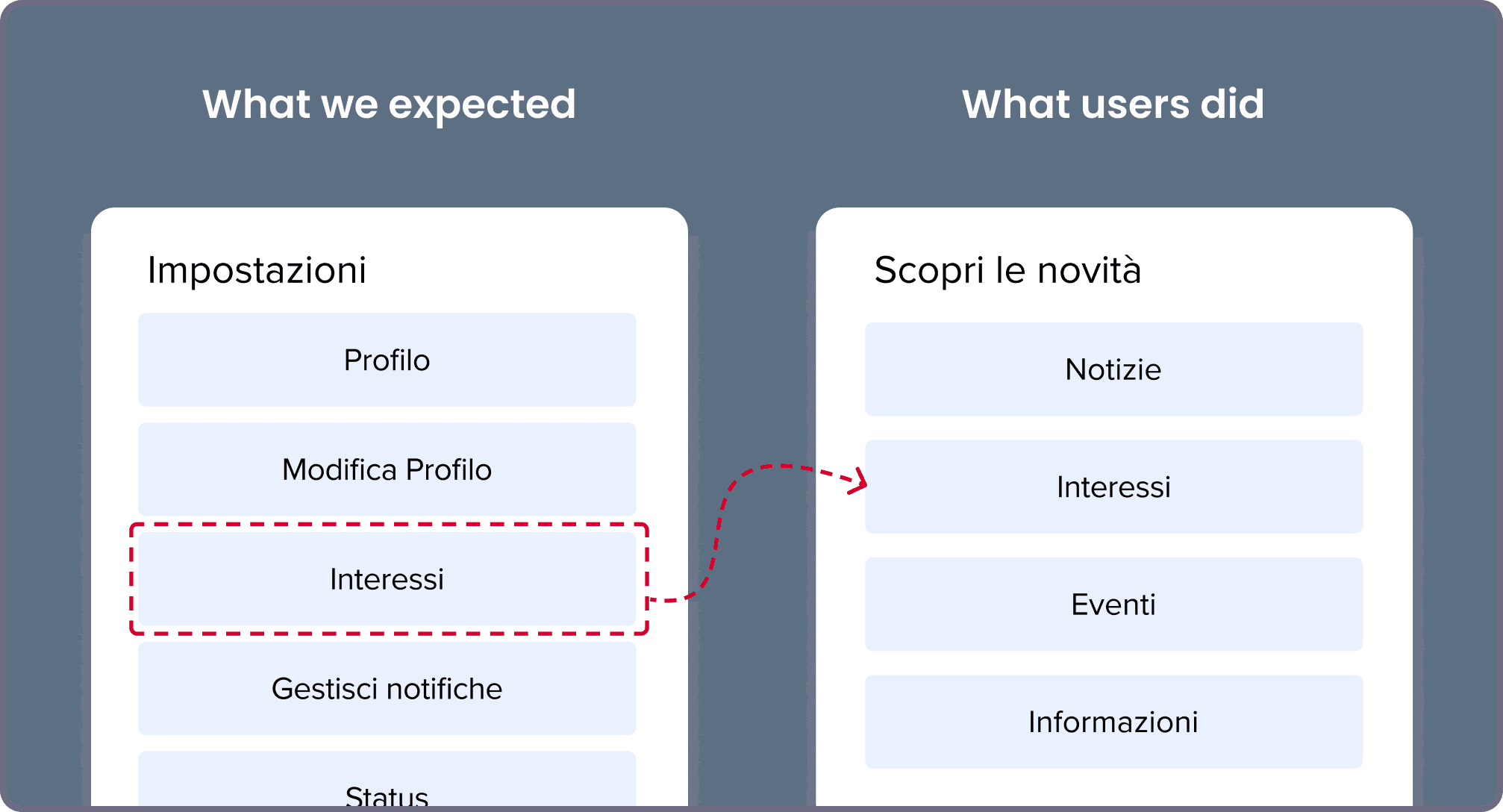
Based on the insights gained from the card sorting analysis, several key observations have emerged. The naming of services and categories was probably not sufficiently clear to users, leading to services being placed under illogical categories, such as the example of "tassa rifiuti" (waste tax) being incorrectly placed under "i tuoi immobili" (your properties) instead of "TARI payments."
Furthermore, the "interessi" (interests) settings, which are intended for selecting personal interests that influence recommended news, were mistakenly placed within the "scopri novità" (discover more) section. This misunderstanding indicates that users perceived it as an informational section rather than a means to personalize their profile.
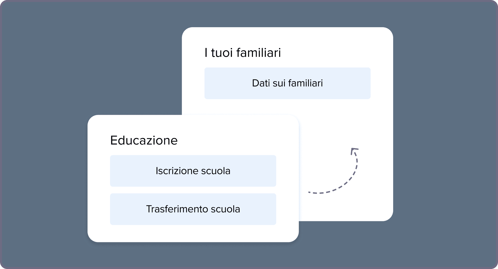
In terms of categorization, some users consolidated all services related to family matters under "i tuoi familiari" (your family members), instead of utilizing the specific sections available, such as "Educazione e istruzione" (Education and Instruction). On the other hand, some users focused solely on data visualization within this category.
To enhance user experience and facilitate easier navigation, it may be beneficial to consider merging certain categories. This consolidation would simplify the user's understanding of where to locate specific services, ensuring a more intuitive and streamlined experience.
Another notable finding was that users expressed a desire to see key events directly related to them displayed on the homepage. This suggests a need for a more personalized and tailored experience for users. While considering this feedback, we aimed to enhance the website by incorporating news and updates that are specifically related to the municipality and its services. Our intention was not to transform the website into an "events" platform but rather to provide valuable information and timely updates that align with the interests and needs of citizens within the local community.
By introducing this feature, the goal is to keep users informed about municipal developments and service enhancements.

Visual Identity
During our analysis, we examined the current version of the web app for the Fascicolo del Cittadino and compared it with the “UI Kit Italia” by Designers Italia, a set of guidelines and resources for public administration sites and services. We discovered that the Fascicolo del Cittadino had numerous violations of the standard guidelines. Fortunately, we were able to access the complete design system, which allowed us to implement a redesigned version in accordance with the current standard.
In the redesign process, we focused on aligning color palette, dimensions, buttons, fonts, icons, grids, and toggles with the established design system. By adhering to these standards, we aimed to ensure consistency and cohesiveness throughout the user interface of the Fascicolo del Cittadino.
This adherence to the design system not only enhances the visual appeal but also improves usability and provides users with a familiar and intuitive experience. By implementing the new redesign version following the standard design system, we aimed to elevate the overall quality and professionalism of the Fascicolo del Cittadino. Users will now benefit from a visually appealing and well-structured interface that adheres to industry best practices and offers a seamless user experience.

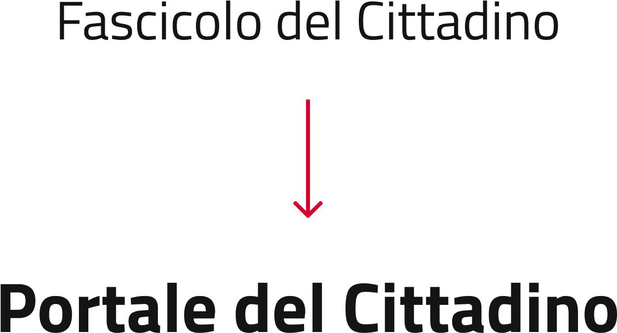
Naming
Taking into consideration the insights gathered from the interviews, particularly regarding the naming of the "Fascicolo del Cittadino," we recognized the need to make adjustments to the labels, starting with the main service name. The interviews revealed that the name "Fascicolo del Cittadino" was not clear to users. They expected the "Fascicolo" to primarily contain document-related content and were unaware that it encompassed various digitally accessible services. To ensure clarity and avoid confusion, we decided to rename the entire service.
The new name had to accurately represent the comprehensive nature of the service, emphasizing that it offers more than just document-related content for individual citizens.
After careful consideration, we chose the name "Portale del Cittadino," as it conveys the purpose it serves to citizens. The term "portale" is widely understood as a gateway or platform, indicating that users will find a range of digital services relevant to their needs within this portal.
By renaming the service to "Portale del Cittadino," we aim to provide users with a clear understanding that the platform offers a broader range of digital services beyond document-related content. This change aims to eliminate any misinterpretation and ensure users are offered with a clear way finding in order to correctly reach the services they require.
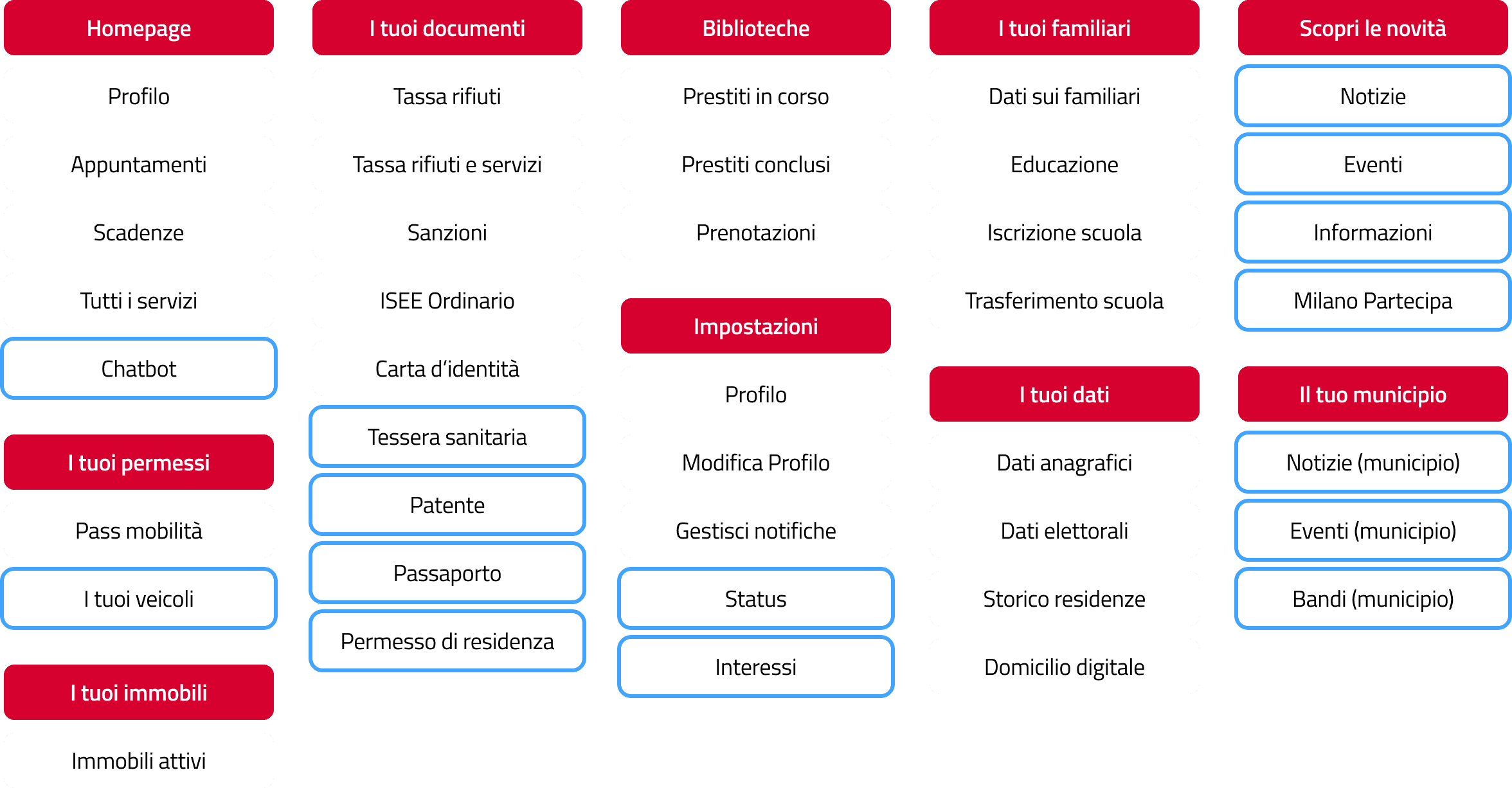
Re-designed Information Architecture
Throughout the process, we carefully considered user feedback and insights gathered from interviews, ensuring that the existing categories such as the homepage, family data, personal data, documents, libraries, and mobility were retained. These categories were recognized as essential components of the Fascicolo del cittadino and served as a solid foundation for the redesign.
Additional services were classified under broader thematic categories.

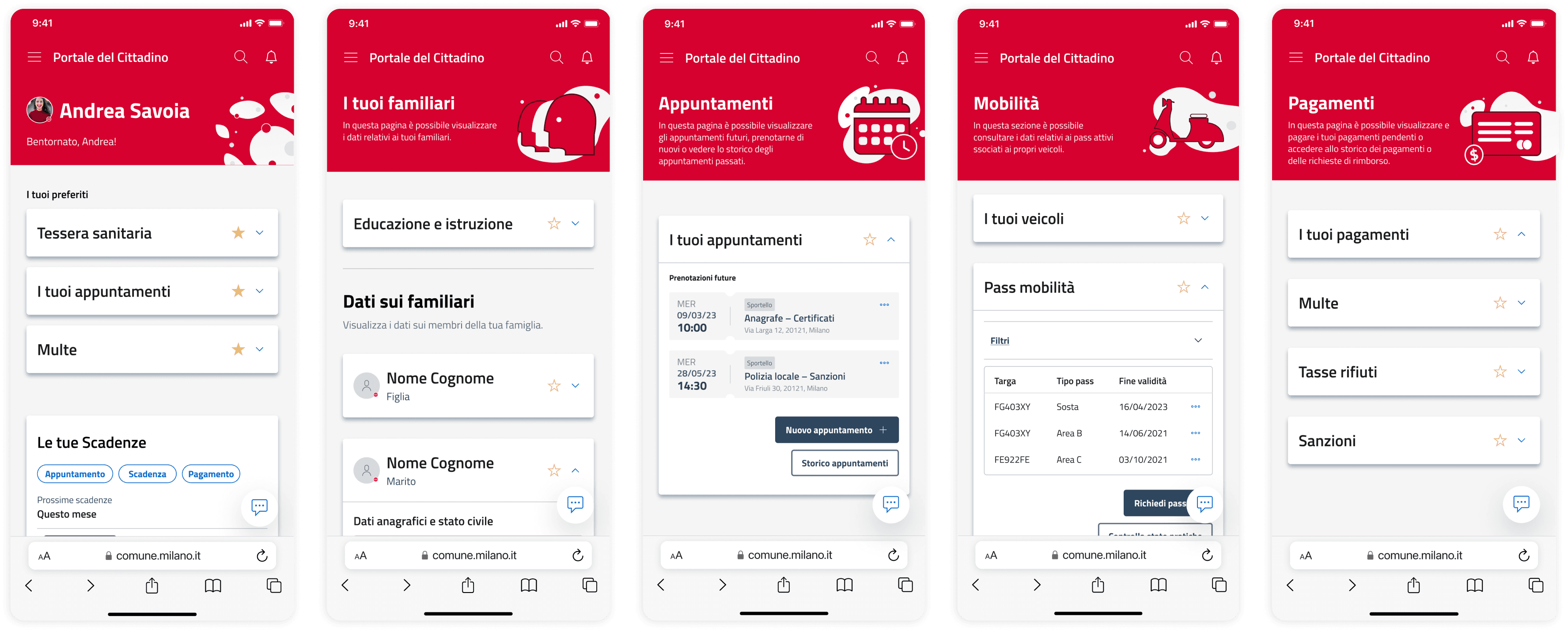
Appointments & Payments
Previously presented as cards on the homepage, have been given dedicated pages to provide more comprehensive information.
Favourites
Additionally, we introduced the option to personalize the homepage by creating a designated space for "favorite services." Users can now select and save the services they frequently use, making them easily accessible and prominently displayed.
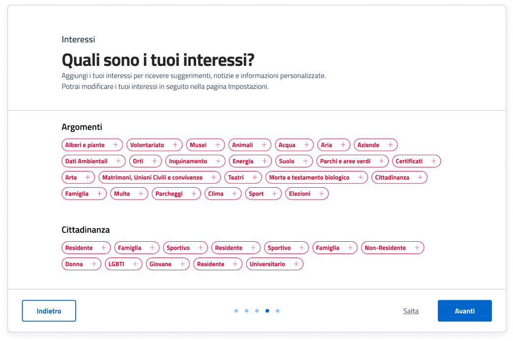
For You
To further personalize the Fascicolo upon initial access, users will be prompted to provide feedback on their interests, such as Tickets, Culture, Events, and more. Based on these selections, relevant news and updates will be displayed on the homepage.
Your Municipality
Moreover, since users access the Fascicolo del cittadino through the SPID service, location-based information will be utilized to offer relevant content based on the user's municipality.
Chatbot
One significant redesign is the implementation of a chatbot.
We introduced an automatic chat feature that provides users with convenient access to assistance. The chatbot goes beyond traditional FAQs, serving as a navigational aid within the service. It not only answers queries on specific actions or problem-solving but also offers rapid access to relevant sections for users who may be disoriented or struggling with wayfinding.
Mobile Website
Wireframe Testing
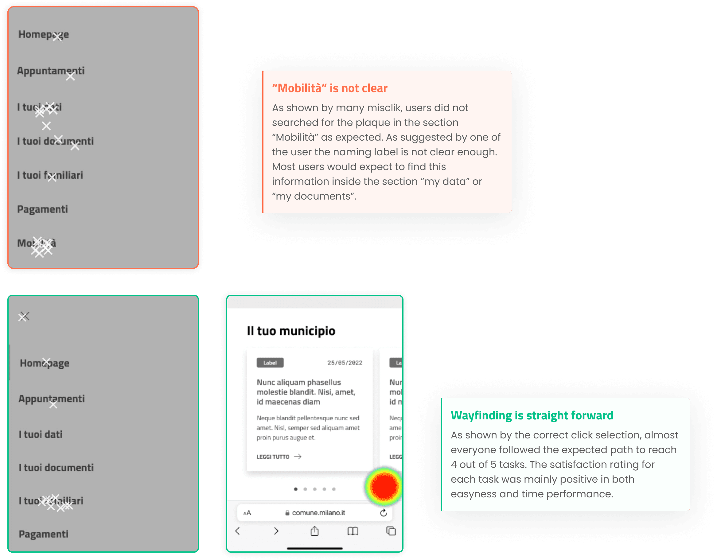
After finalizing the overall structure of the web app, we proceeded to create a mid-fidelity prototype for testing purposes. We conducted a maze test, consisting of 5 comprehensive tasks, to evaluate the main functionalities. A total of 12 participants tested the prototype, and the overall feedback was highly positive. The wayfinding within the app proved to be clear, as nearly everyone successfully completed the tasks.
However, two issues were identified by the users. Firstly, some participants found the chatbot less noticeable than expected, discovering its presence only after exploring other sections. To address this, we increased the shadow effect on the chatbot's main icon to enhance its visibility.
Secondly, there was some confusion regarding the "Mobility" category, specifically related to the naming label of the service. Users initially searched their license plate within "Your Data" and "Your Documents" sections before finding the correct location. Since this naming convention was taken as it is in the current version of the Fascicolo del cittadino, we decided to keep it as is.
Mobile website main pages
Stakeholder Showcase
The showcase provided us with valuable feedback from the municipality's representatives, including some who had not been involved in previous revisions. One particularly interesting suggestion that emerged from the review was the inclusion of an assistance section for trouble tickets within the Fascicolo del cittadino. We were not previously aware of this feature, as it was currently implemented on the municipality's website through a WhatsApp chat. A representative proposed incorporating the ticketing system directly into the Fascicolo and creating a dedicated section where citizens can track the progress of their tickets in real-time. This would empower citizens to take control of their requests, reducing the workload of municipality operators.
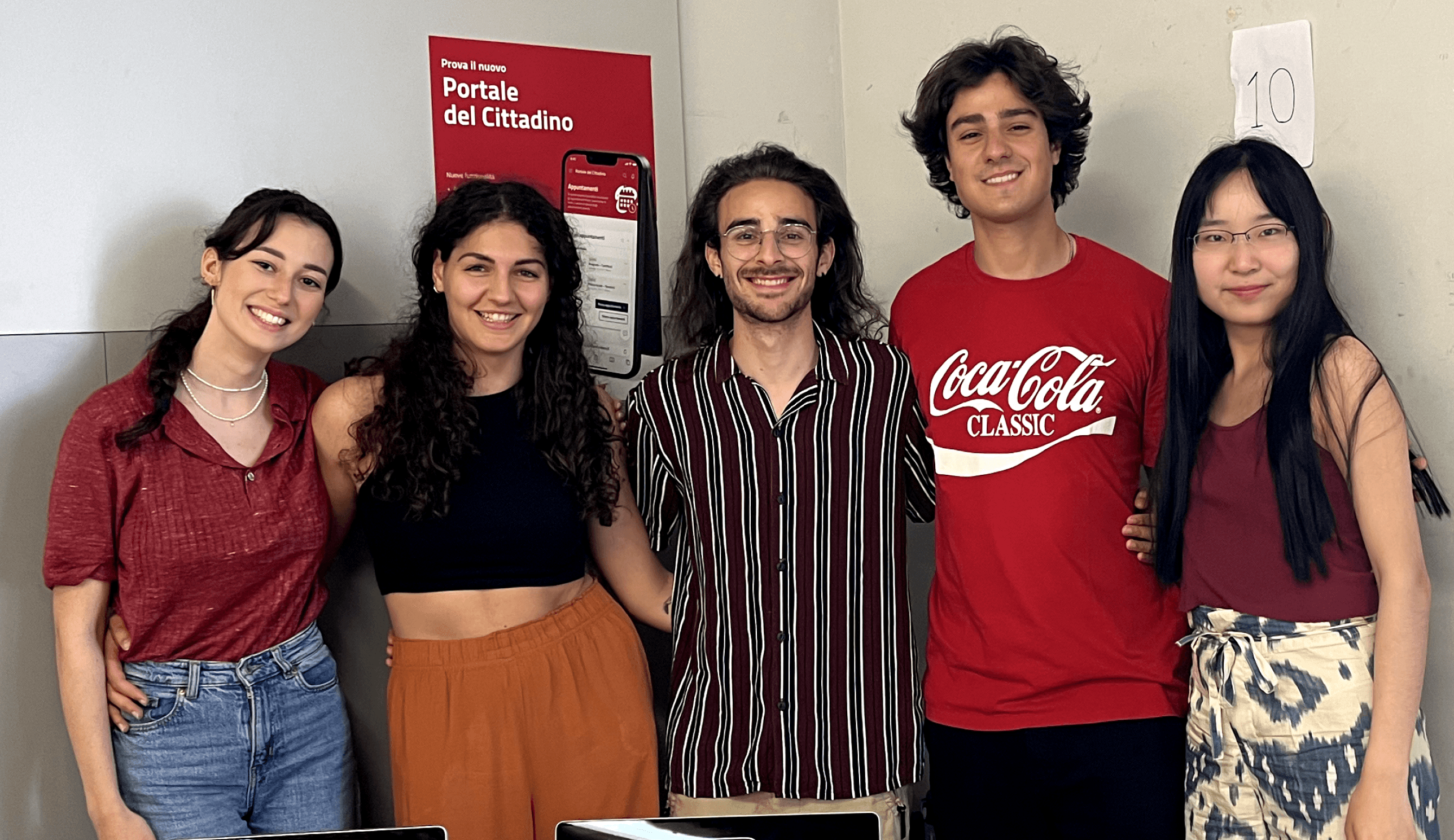
The team
Sofia Corbetta - Chiara Poma - Giovanni Pacifico - Andrea Savoia - Wang Shuang
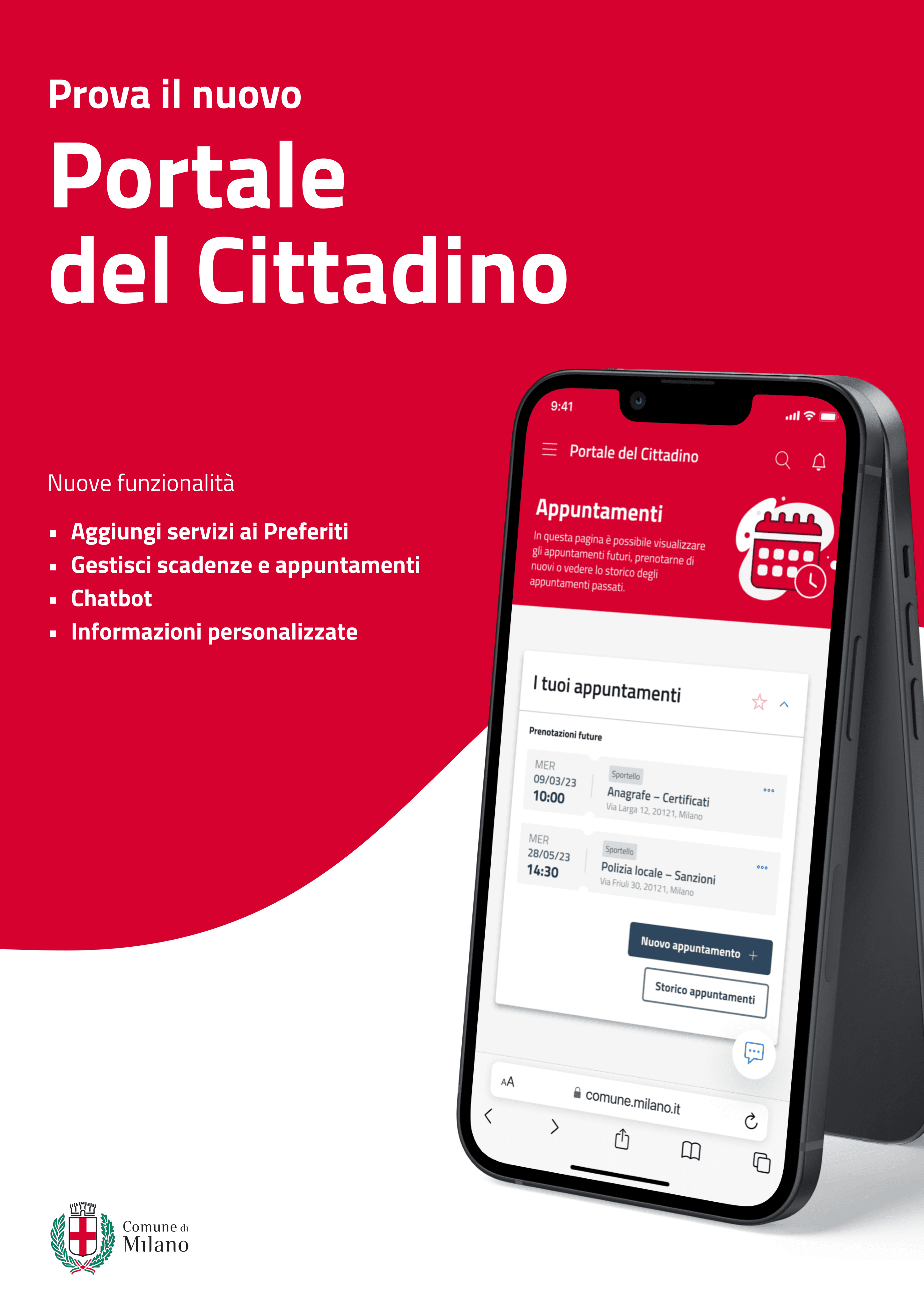
Promotional Poster
Promotional Flyer

Improvements
To implement this valuable feature, a dedicated "Assistenza" section was created within the Fascicolo where citizens will be able to check on their tickets, both old and current, and open new ones. This section provides a centralized space for managing their assistance requests. Additionally, the chatbot serves as more than just a help section; it acts as a comprehensive guide, capable of seamlessly categorizing and submitting tickets directly within the chat interface. This integration of the chatbot and the Assistenza section ensures a seamless and user-friendly experience for citizens seeking assistance.
To ensure transparency and clear communication, we have implemented three distinct labels for tickets, providing users with a clear understanding of the status of their requests. The first label, "Ricevuto" (received), signifies that the request has been successfully submitted but has not yet been opened by an operator. The second label, "In lavorazione" (in progress), indicates that the ticket is currently being handled by an operator. Finally, the label "Completed" denotes that the ticket has been resolved and successfully closed. These labels enable users to easily track the progress of their tickets and stay informed throughout the process, enhancing their overall experience with the Fascicolo del cittadino.

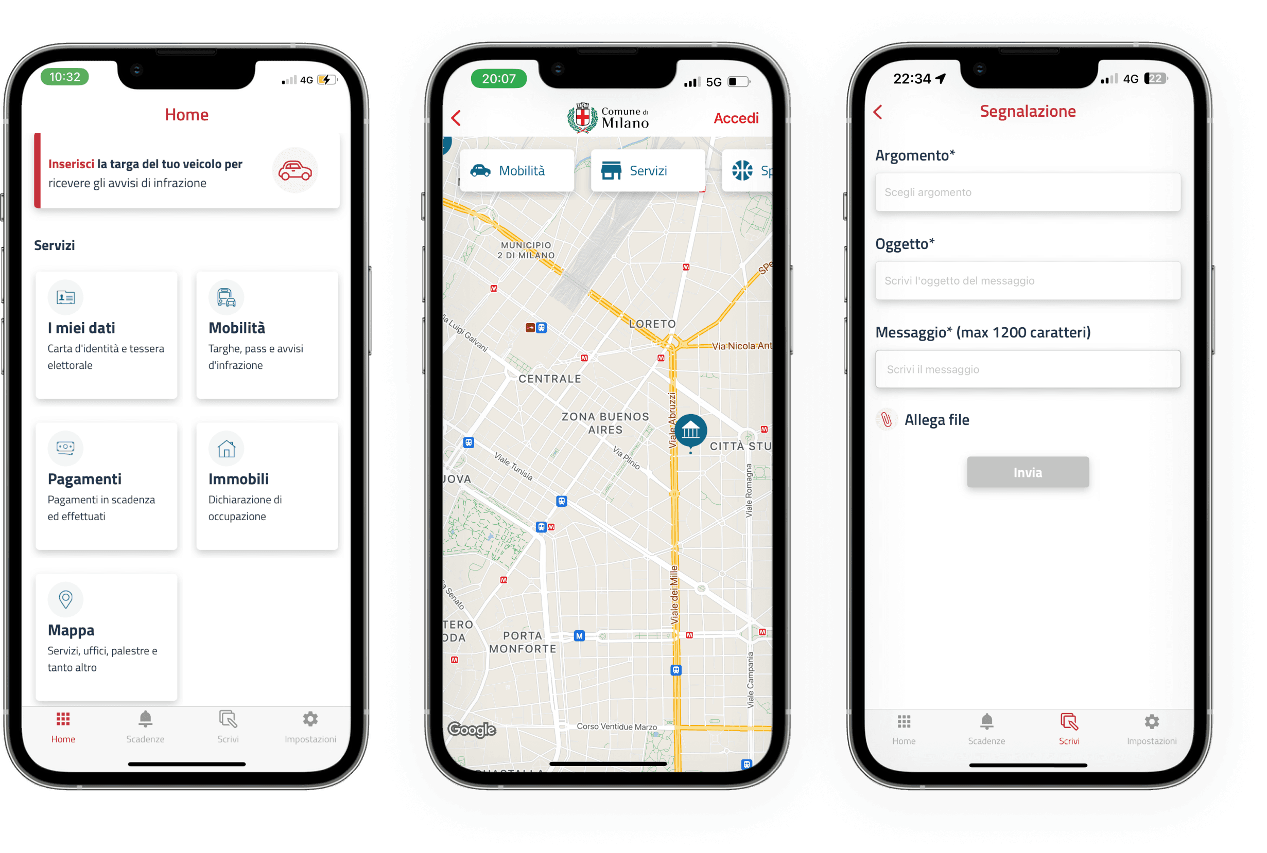
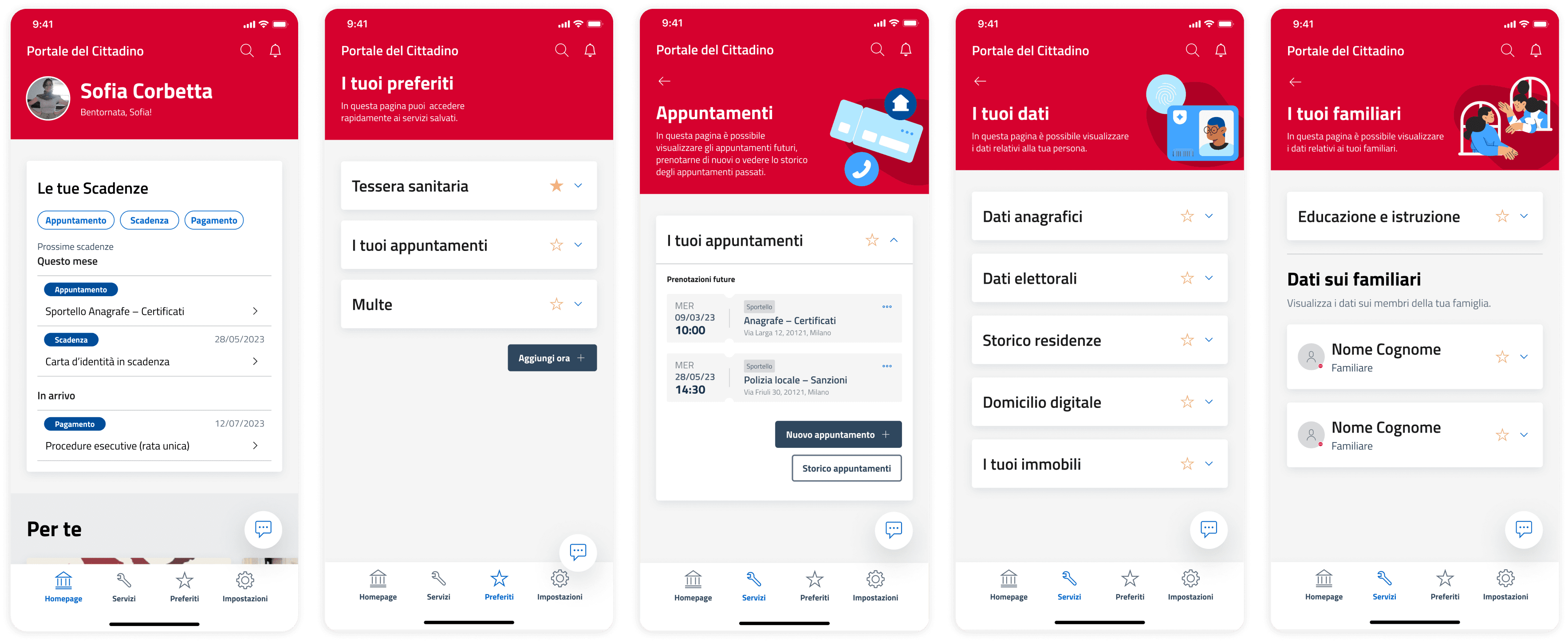
Mobile App
From Browser to App
Building upon the web app version,
we extended our redesign efforts to the main app. In order to create a seamless app experience, we made several modifications to the layout.
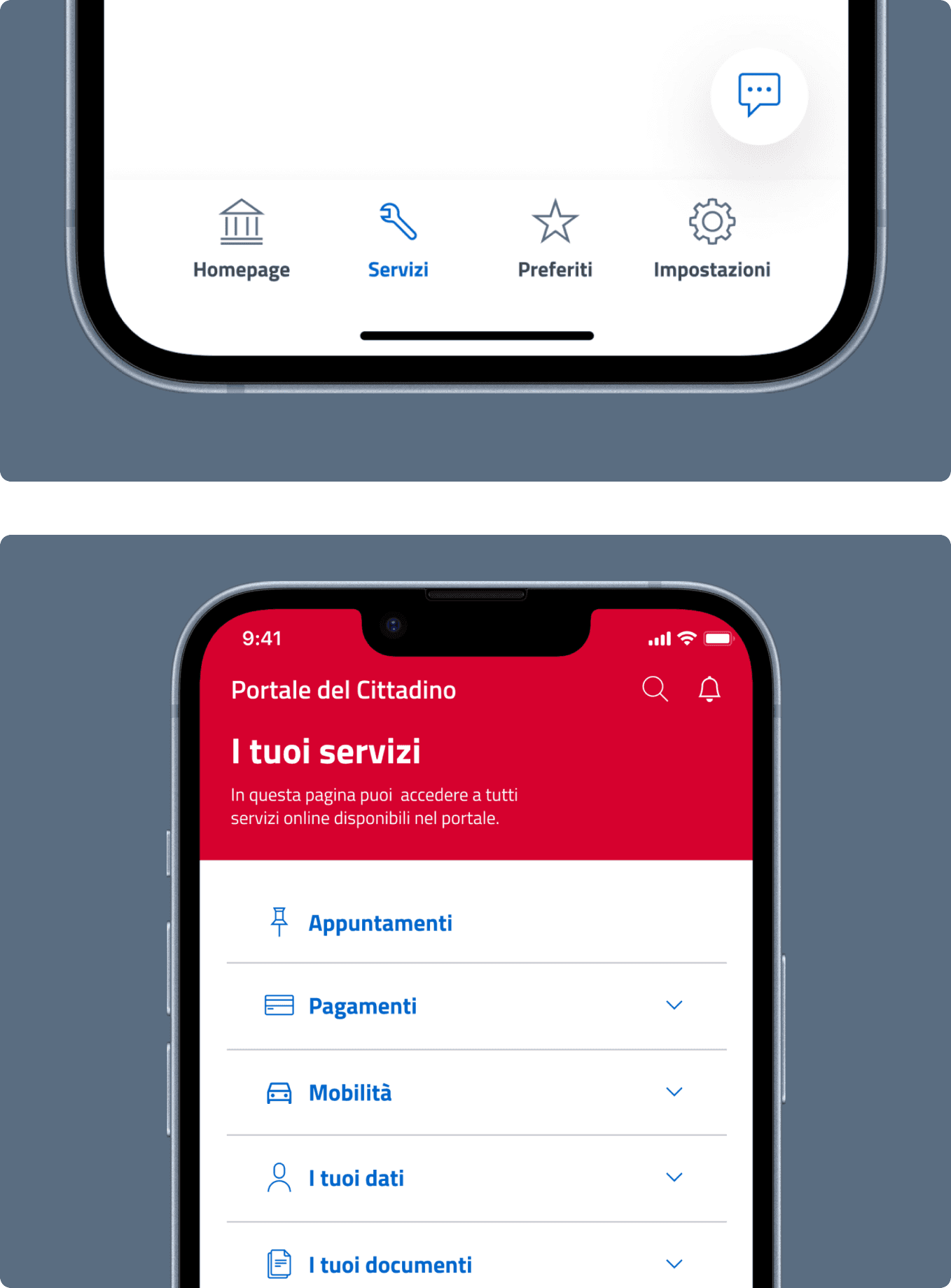
One significant change was the removal of the burger menu, which was replaced with a navigation tab bar for easy and intuitive navigation. The navigation tab bar consists of four main sections: homepage, favourites, settings,
and services.
The homepage acts as a centralized hub where citizens can find personalized news and important deadlines
at a glance. In the web version,
the favourites section was integrated within the homepage. However,
to provide a more focused and streamlined experience, we have made
the decision to give the favorites section its own dedicated space, allowing it to have more prominence and avoiding information overload.
The settings section will provide access to the assistance section, where users can consult or open tickets for support.
The services page serves as
a comprehensive directory, containing all the services accessible through
the Fascicolo. The seven categories from the web app have been retained, enabling users to navigate to specific services based on their needs. These modifications ensure that the app provides a user-friendly and efficient way for citizens to access the services offered through the Fascicolo del Cittadino.
Mobile app main screens
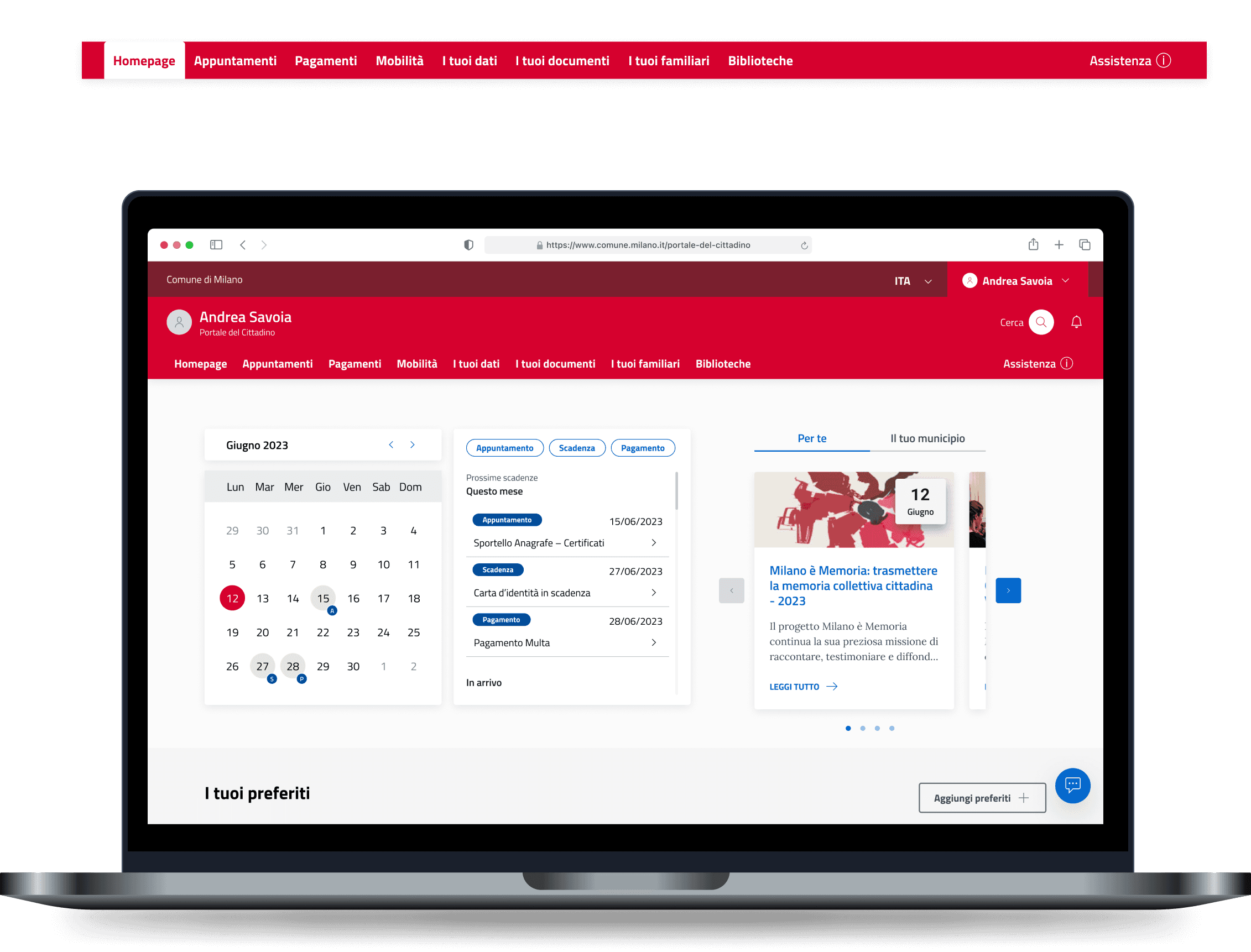
Desktop Website
From Mobile to Desktop
For the desktop version, we have made adjustments to the navigation menu to ensure it fits within the width of the screen.
The homepage serves as the central hub, featuring both news and the favourites section, aligning with the structure of the web version. To adhere to standard conventions, the settings access has been relocated into the partial header.
Additionally, the assistance access has been given a prominent position for easy access in the right corner of the navigation menu.
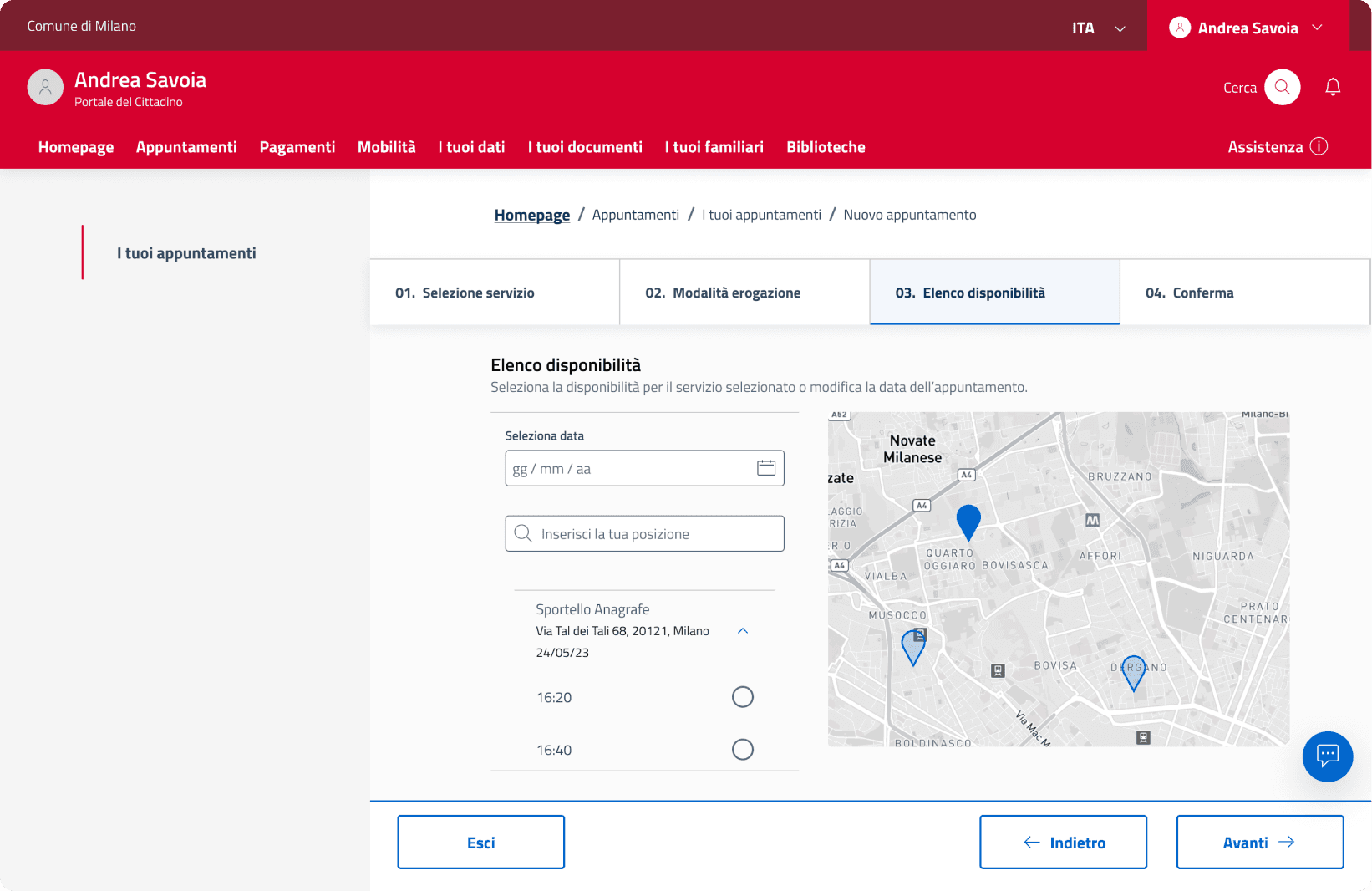
Furthermore, in the appointments section, a map has been incorporated into the booking process, providing users with a quick overview of the office locations.
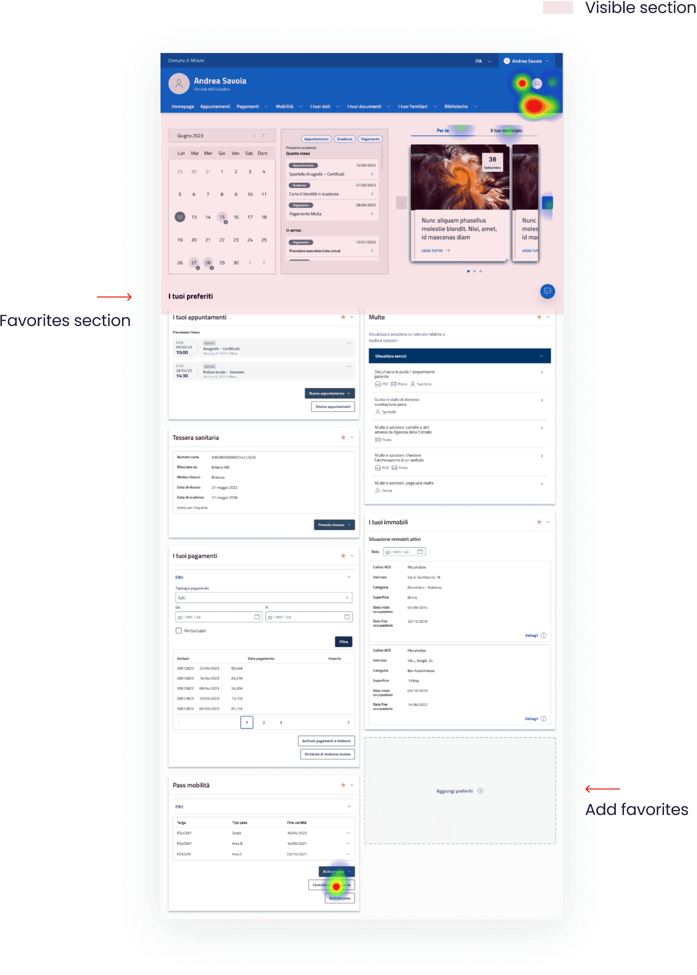
Mid-fidelity testing
After finalizing the overall structure of the website, we proceeded to create a mid-fidelity prototype to evaluate the clarity and effectiveness of our changes. We conducted a maze test consisting of 8 comprehensive tasks, and 9 participants tested the prototype. The overall feedback was predominantly positive, with all tasks successfully completed as expected. However, we received valuable suggestions for improving the overall user experience.
Some users expressed difficulty in initially locating the favorite section and recommended moving it higher on the page. However, considering that users may have a large number of favorites, moving them above would hide the news and deadline calendar, which most users found useful.
To address this, we sized down the upper section, allowing the favorites to stand out more while still maintaining visibility for news and calendar.
Initially, all favorite cards were displayed in an open state upon accessing the homepage. However, user feedback indicated that this could be overwhelming and lead to confusion. To address this, we modified the design so that the favorite cards are collapsed by default, allowing users to easily expand and collapse them as needed.
Desktop version main pages


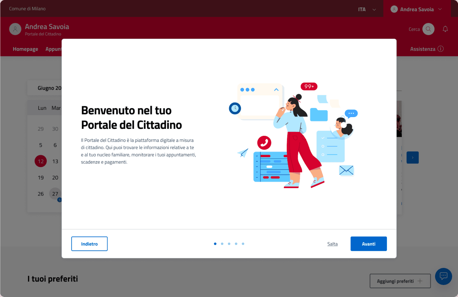
Onboarding
When first accessing the Portale del Cittadino, users will be greeted with onboarding screens, designed to welcome new users and showcase the main features of the website. We have chosen to explain during the onboarding process that the site is open to all types of citizens, whether they are residents, workers, or students.
Afterwards, we will ask them about their status and interests related to various topics and civic life. These data will then shape the type of information displayed on the homepage, tailoring news about services and the municipality based on their interests.