HolidayPirates
Mobile App Redesign
Developed at
Timeline
March 2023
April 2023
My Role
UX Research
UX Design
UI Design
User Testing
Tools
Figma
Maze
Summary
The first project of the Digital Design Studio course. The aim of the exercise was to explore a large amount of testing methods, gather insights and redesign an existing application according to well-established design methodologies.
Brief
Select a case-study and after performing heuristic evaluation and user tests detect existing problems and translate them into an effective and functional solution.
Outcome
A complete analysis and re-design of the mobile application of HolidayPirates.
Analysis Method
The Goal
Identify the problem areas of our application and later translate these usability issues into redesign requirements, to be presented in a clear way.
The Methods
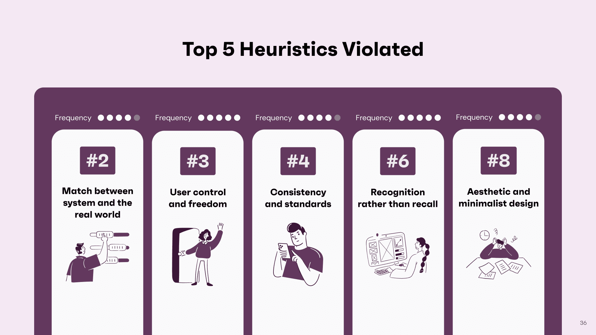
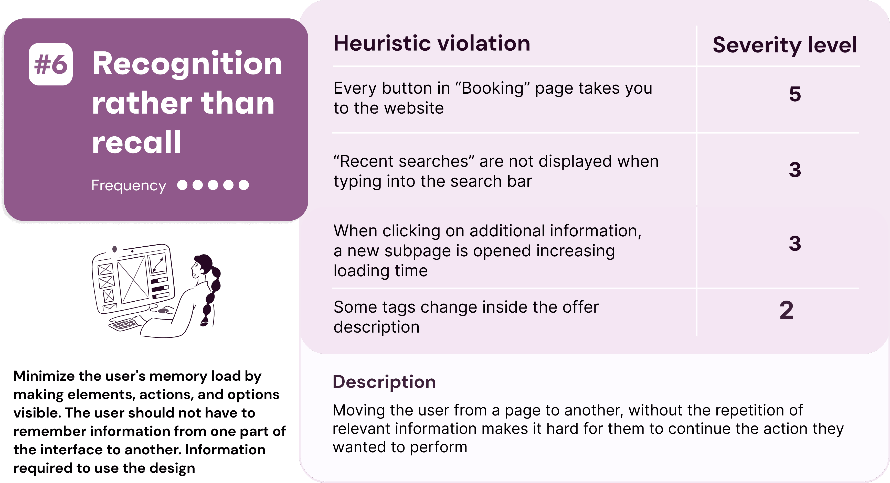
Heuristic Evaluation
We conducted an Heuristic Evaluation to identify problem areas of our app by testing it directly, and later find solutions to eventually solve them.
User Testing
We performed an usability test to determine how well the software satisfied usability requirements of its targeted users.
The case study
HolidayPirates is a mobile app that helps users find affordable travel deals. It offers discounted flights, hotels, vacation packages, cruises, personalized recommendations and travel tips to help users plan their trips.
App Overview
Heuristic Evaluation
Each team member performed their own heuristics evaluation. In order to choose and validate consistency of any identified usability issues, the three experts eventually got a review session to produce a final evaluation.
Scenario of Use
Target User
Lazy Planners
People who like planning their journeys without too much effort.
Cheap Travellers
Young people or families with low budgets.
User Goals
Save Time
Avoid spending too much time on planning a trip.
Planning
People who want to have their journey planned beforehand.
User Background
Adventurers
Adventurous people who are searching for a cheap journey to book.
Adaptable
Not too demanding and highly adaptable.
User Expectations
Find Trips
Find cheap offers in travellers’ available days regarding flights, accommodation, or both.
Get Good Offers
Have a good balance between cost and quality.
User Knowledge
Digitally Experienced
People who know how to search for good offers online.
Deal Seekers
Who always want to find the best deals.
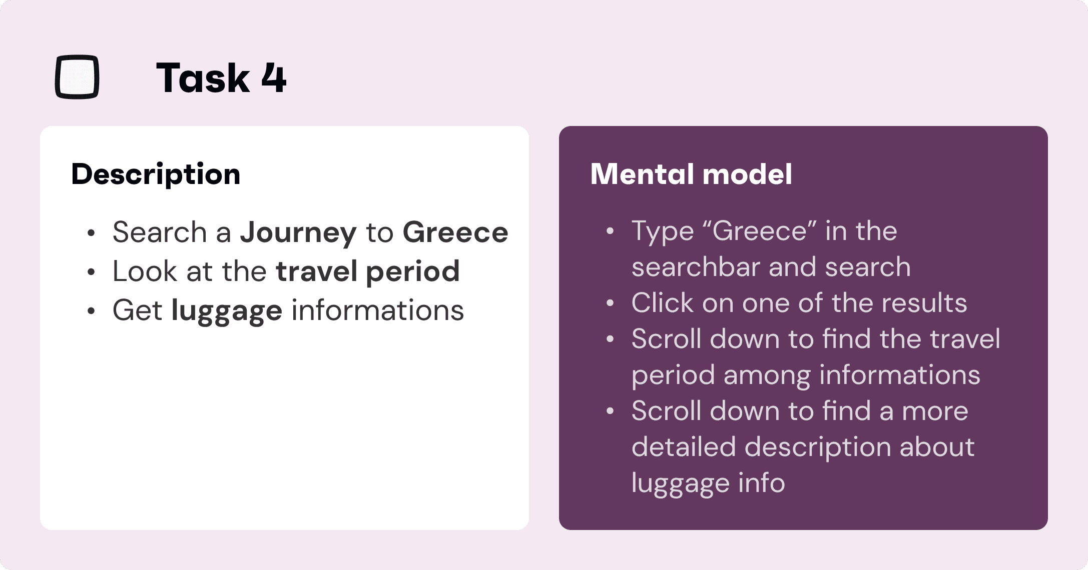
Task definition
We set objectives and selected tasks for the analysis
We outline user's mental models for the achievement of each tasks


Expert Evaluation
We adopted the target users’ point of view to accomplish their objectives
We produced a final evaluation by cross-checking the expert’s notes


User Testing
Main Objectives
Understand how the app met users’ usability needs
Identify problem areas of the interface
Questionnaire
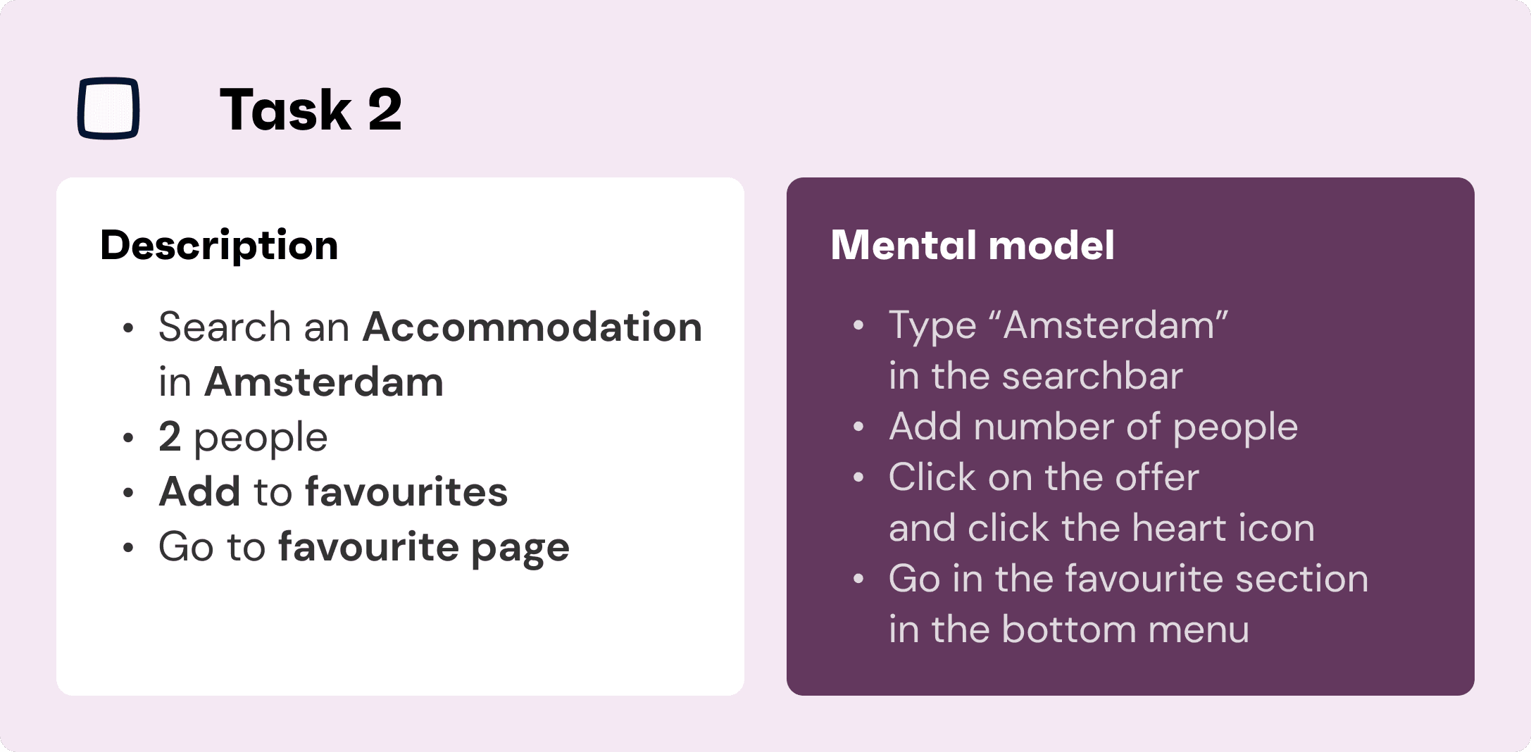
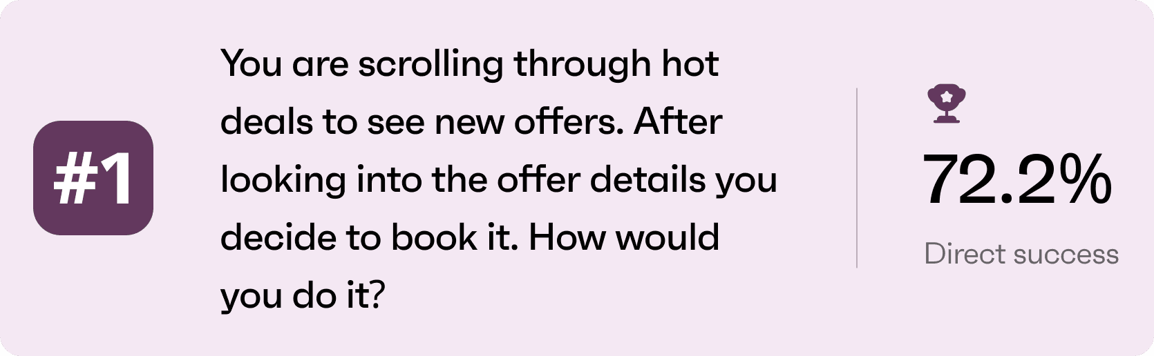
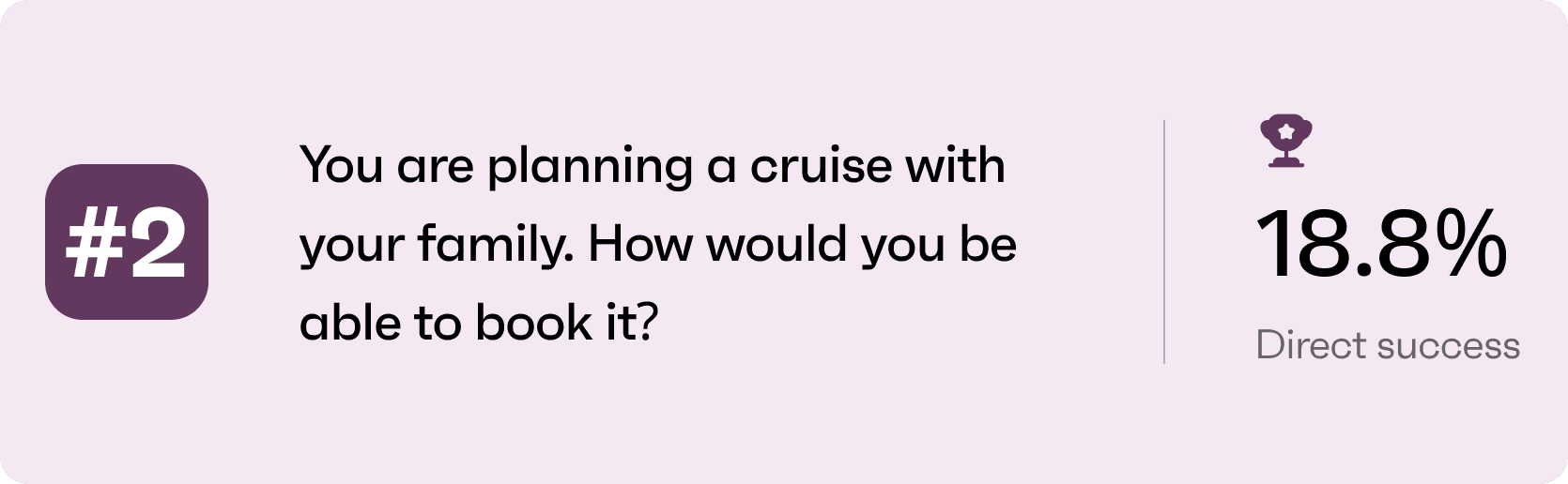
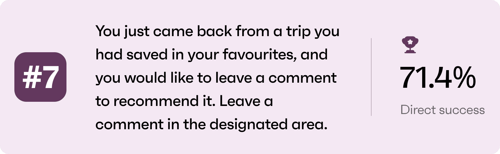
Set 5 tasks for our users to accomplish.
Structure the questionnaire for collecting data.

Testing Participants
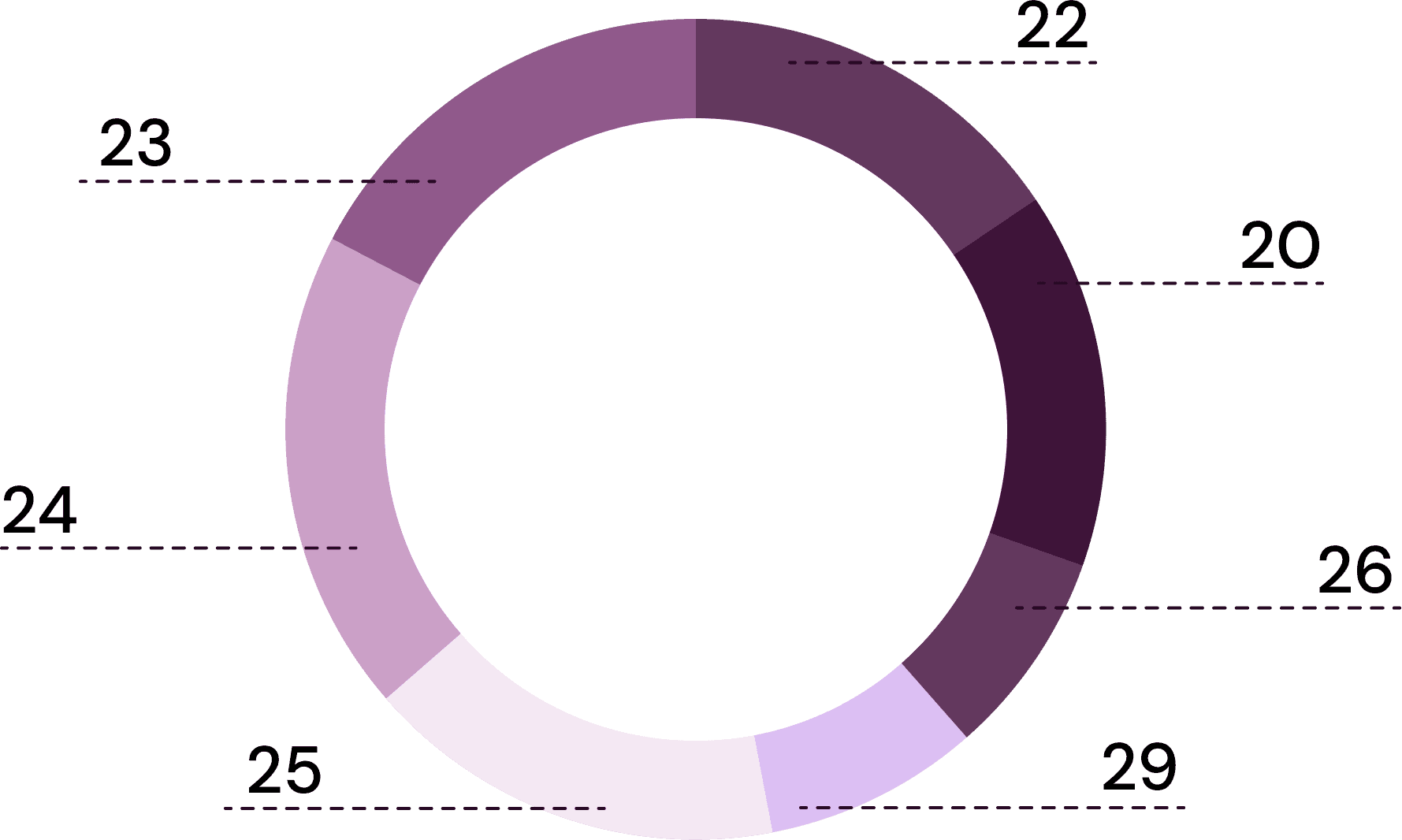
User Age
Based on our user’s identikit we identified our age range, which we restricted to users aged between 18 to 30, assuming that the majority of people in this range of age are not particularly wealthy but still look for adventures journeys. Also younger users may be more likely to prefer mobile-booking experiences compared to other options.
Gender & Occupation
Testing an app with both familiar and non-familiar users was important to gather different point’s of views regarding usability issues.

Test Results


Problem Definition

Expert vs User
We matched the heuristic analysis results with users’ feedbacks collected in each task.
In doing so, we understood that our severity judgement were validated by the insights collected with the user testing.

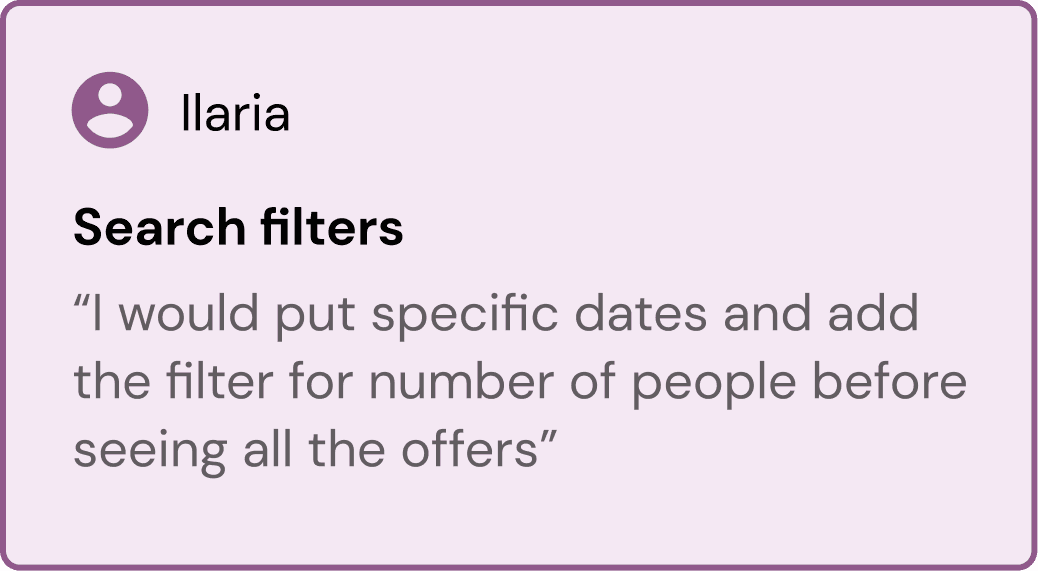
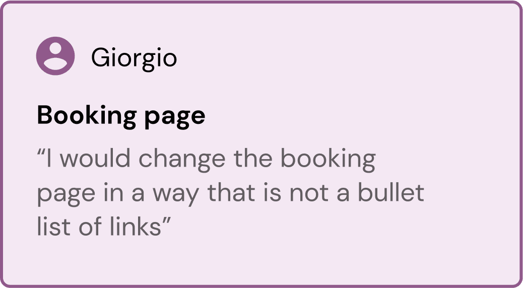
User’s Suggestions


Redesign Method
The Goal
Verify insights from previous analysis through user experience testing.
To identify and fix problems related to information architecture and UI design.
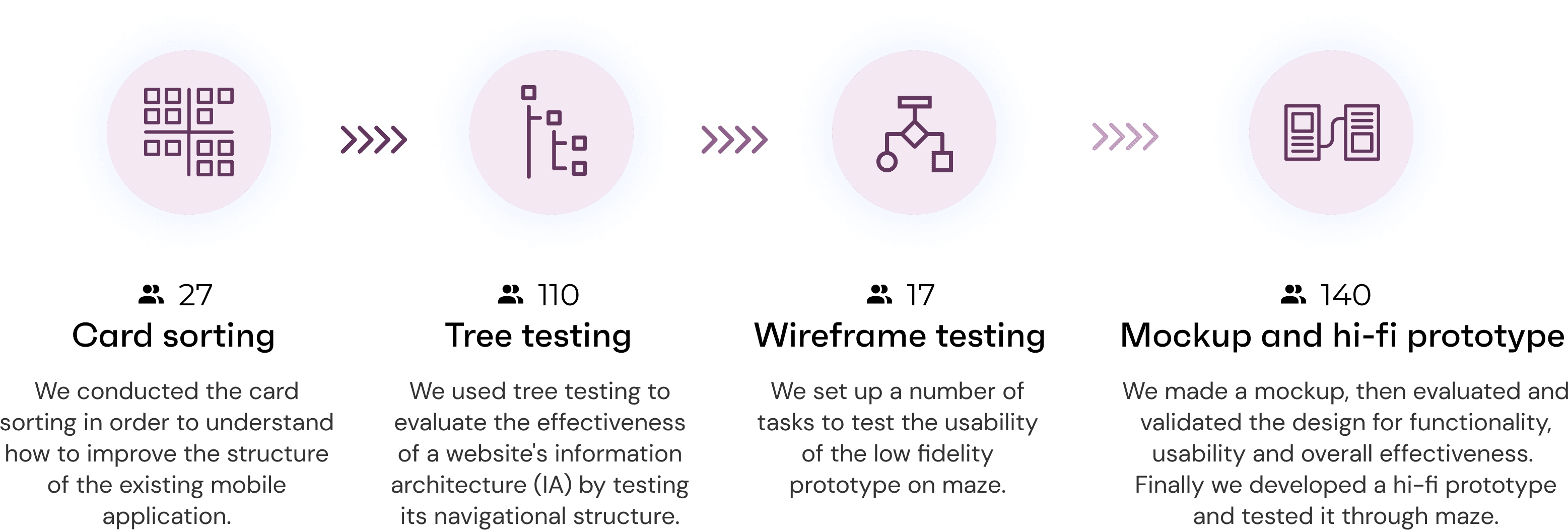
The Methods
Conduct the analysis
through card sorting, treetesting and testing of different levels of fidelity prototypes.
Design Process
Timeline

Card Sorting
Objectives
Understand & Conceptualise
Analyze how user understand and conceptualise travel search and booking information.
Reveal Users’ Mental Model
Understand where user want to search and browse for offer information when accessing the app.
Classification Judgement
Find out if users agree with the placement of the cards in the pre-arrenged categories.
Improve Information Architecture
Card sorting show how users approach IA, giving us the data to create an intuitive navigation.
Open Card Sorting
We arranged information in the app based on the issues identified by the preliminary User Testing, and generated 33 tags of content related to offer information, search, filter, settings, etc. Used to allow users to categorise.

We used Figma for open card sorting and distributed the link to target users to fill cards in. These were the instructions: Explore the cards. Name the groups and sort the cards according to their similarities. Sort no-sure labels inside the “Not Sure” category.
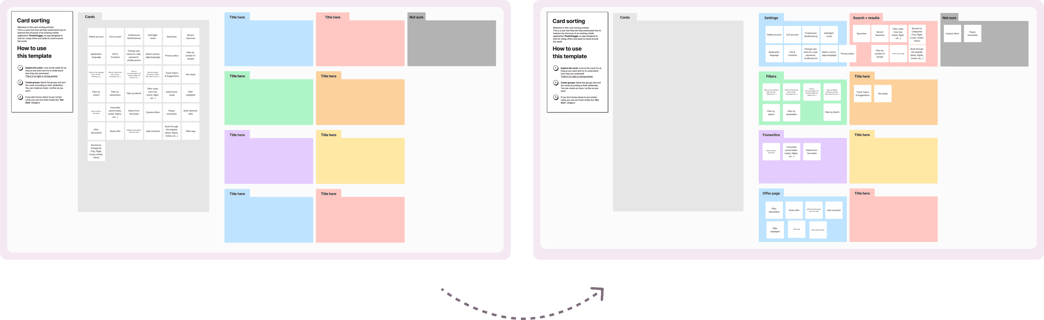


Closed Card Sorting
We use Maze for close card sorting and distribute link to target users to fill in.


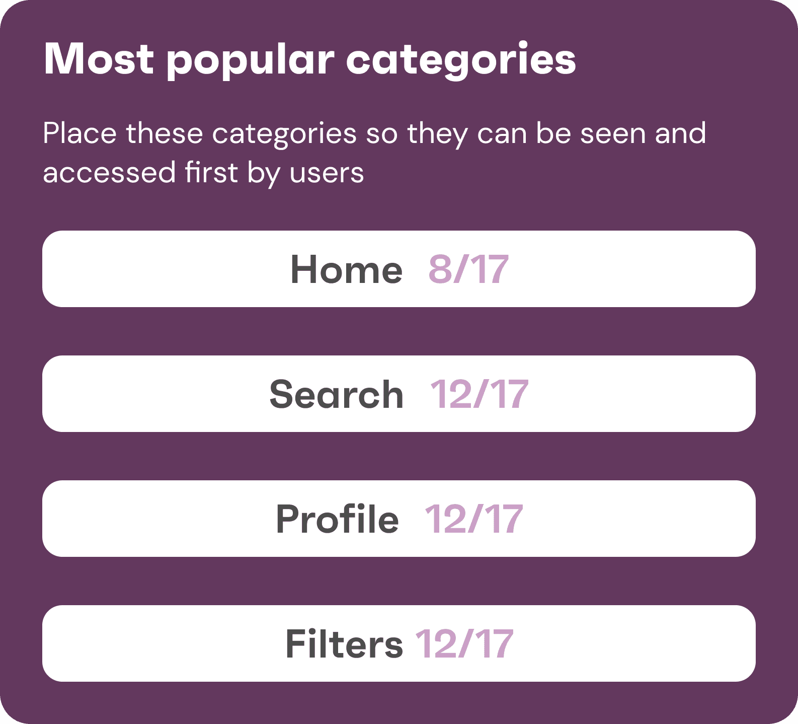
Tree Testing
Objectives
Test the usability of our navigation
With tree testing, we identified navigation issues early on and made improvements to make sure users can quickly find the information they need.
Assess the discoverability
We used it to assess the discoverability, labelling, and information architecture of our application.
Validate Information Architecture
Tree testing allowed us to test and validate the information architecture.
Outline of the three structure on Maze.
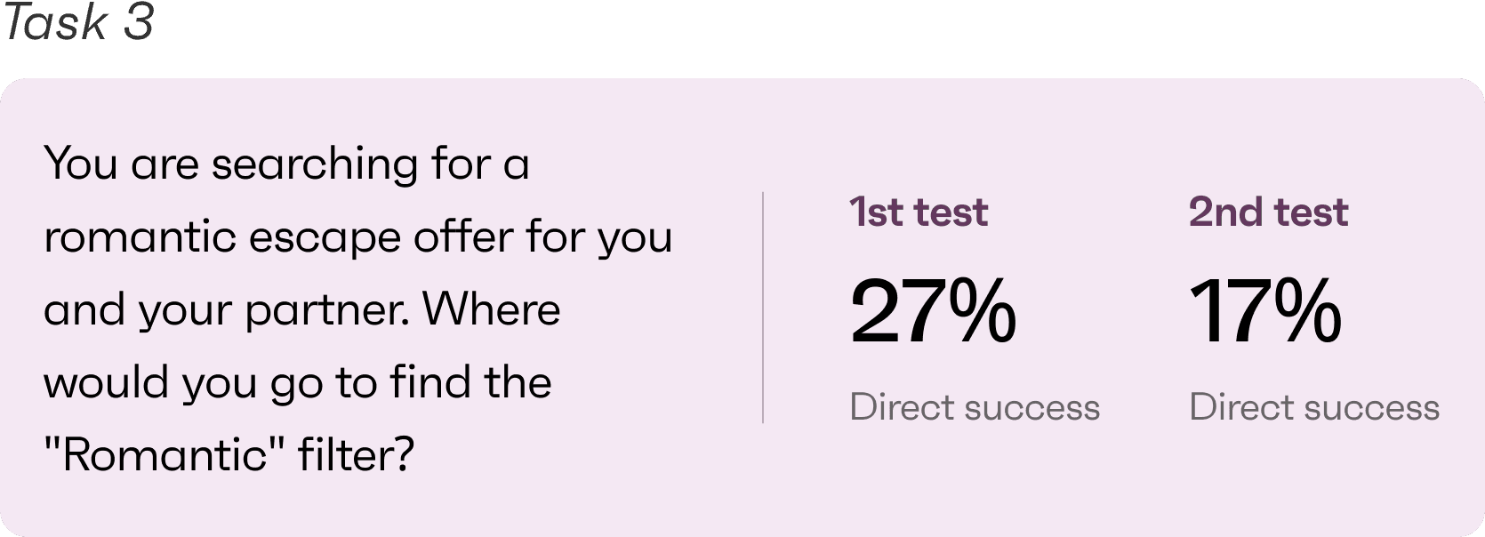
Task definition
Reach target users to perform the activity.
Interviewed target users and analyse the results.
Based on the 1st results, second iteration of the tree structure and the tasks description.
Fixed tree testing.
Analysis of the test results.
Definition of the first information architecture.
Tasks


Information Architecture
IA Breakdown
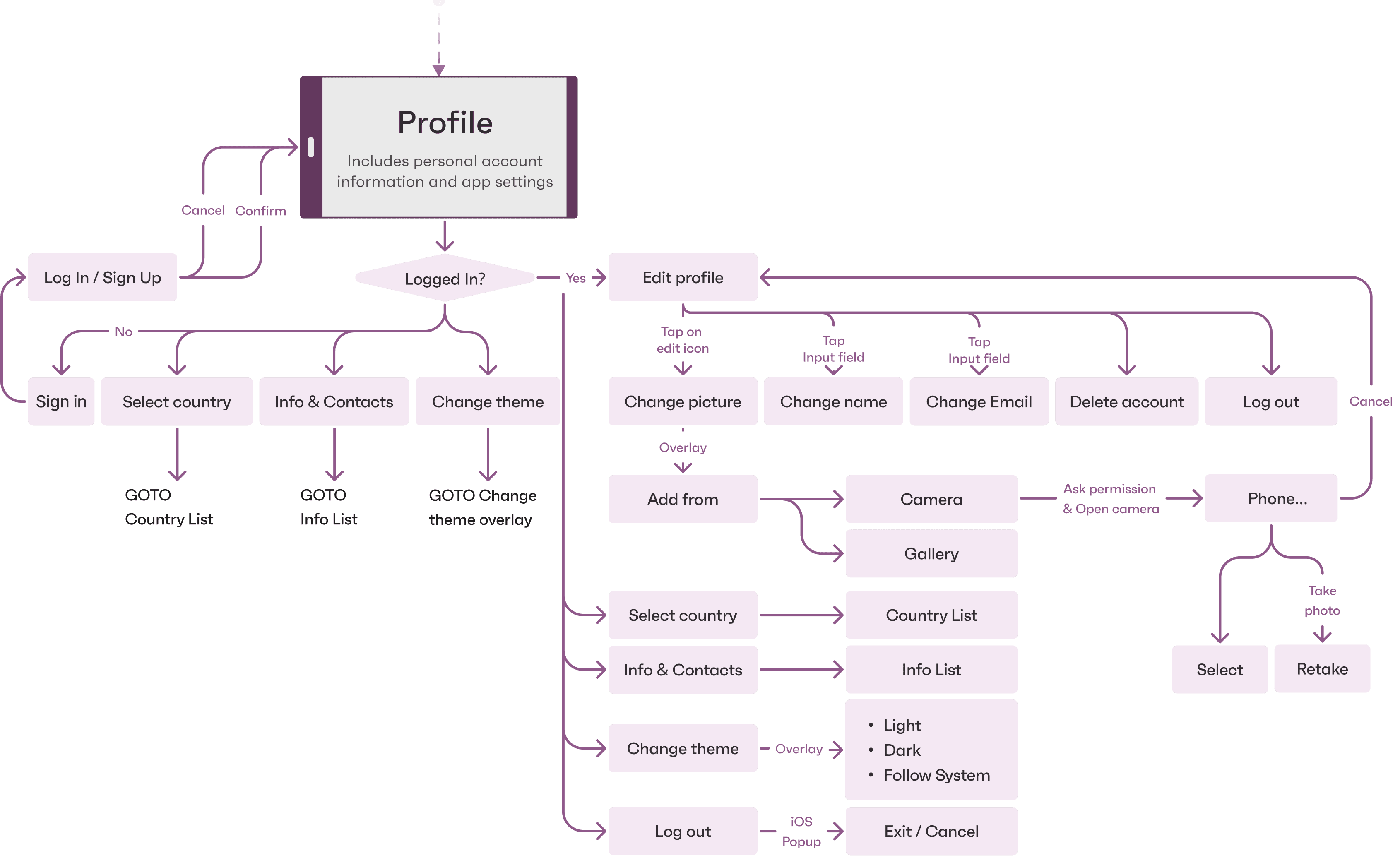
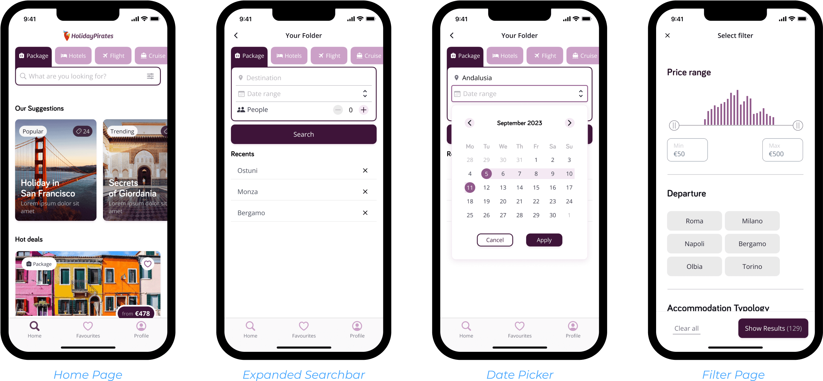
Tab Bar
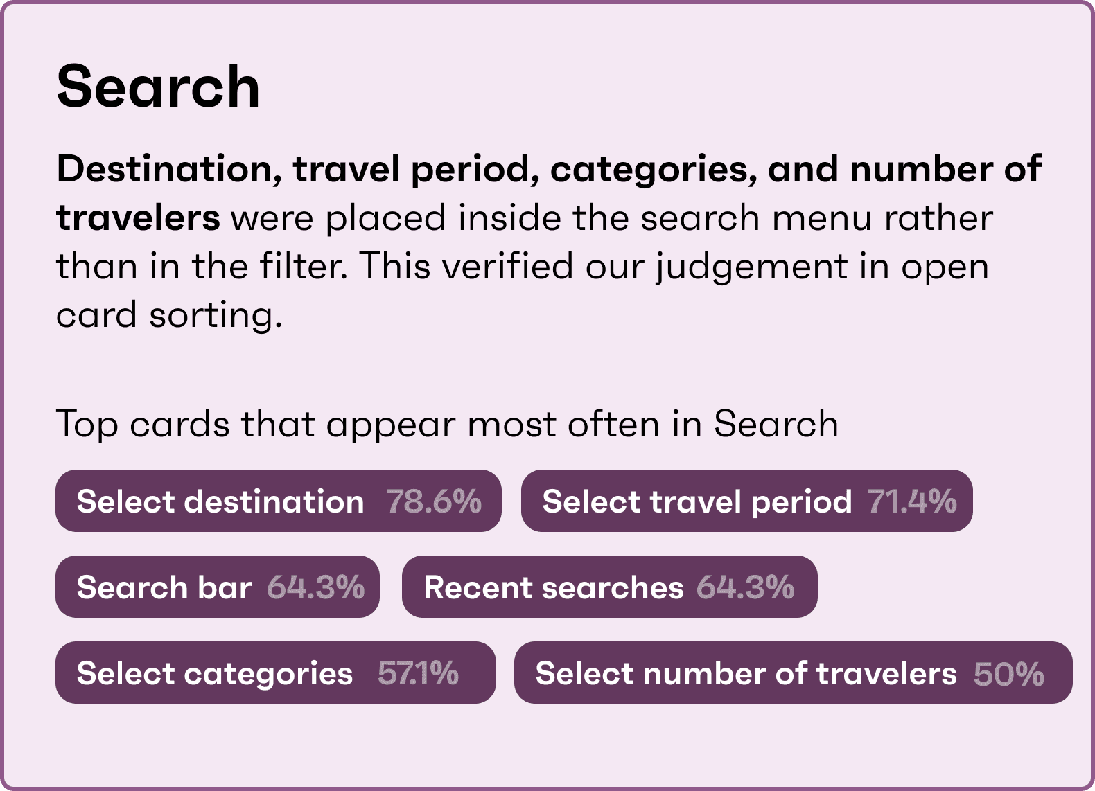
We optimised the original information framework of the app and placed the search section at the top of the home page. This is in line with the user's operating habits. We have also changed the log in section to profile.
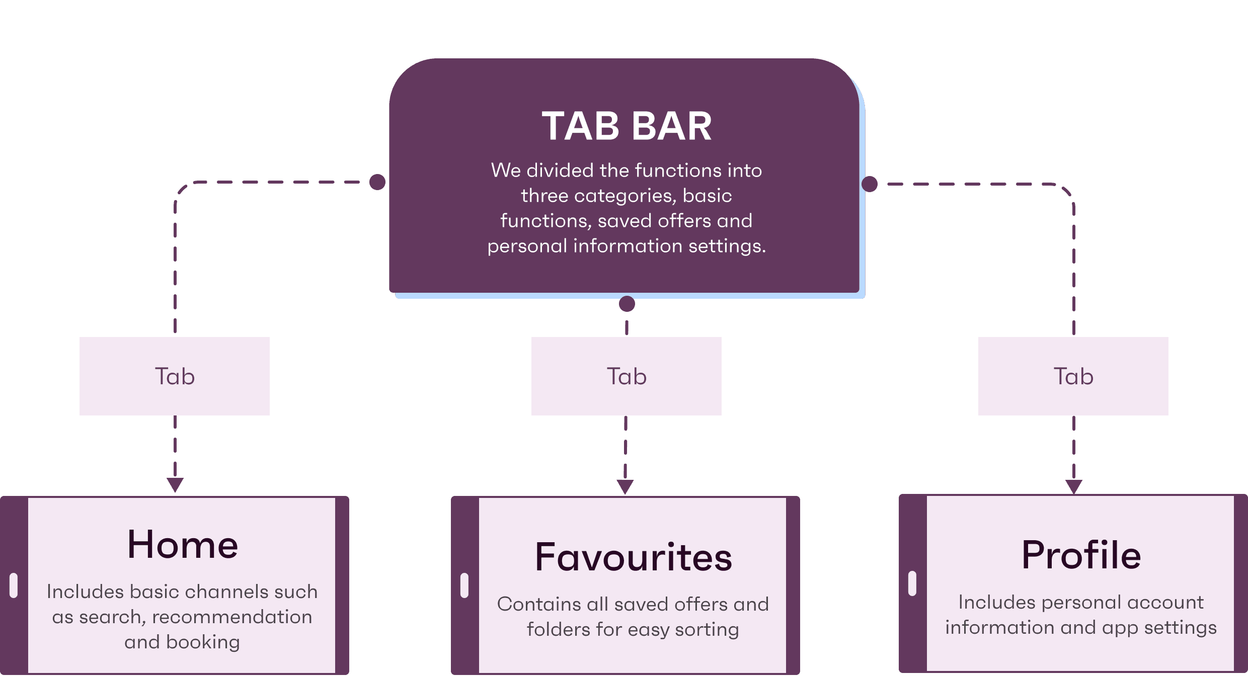
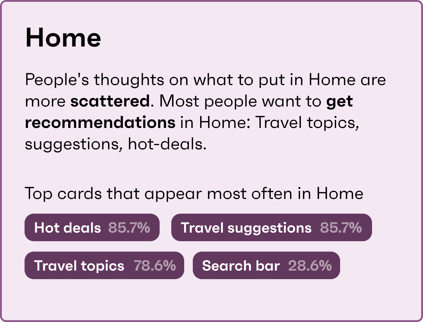
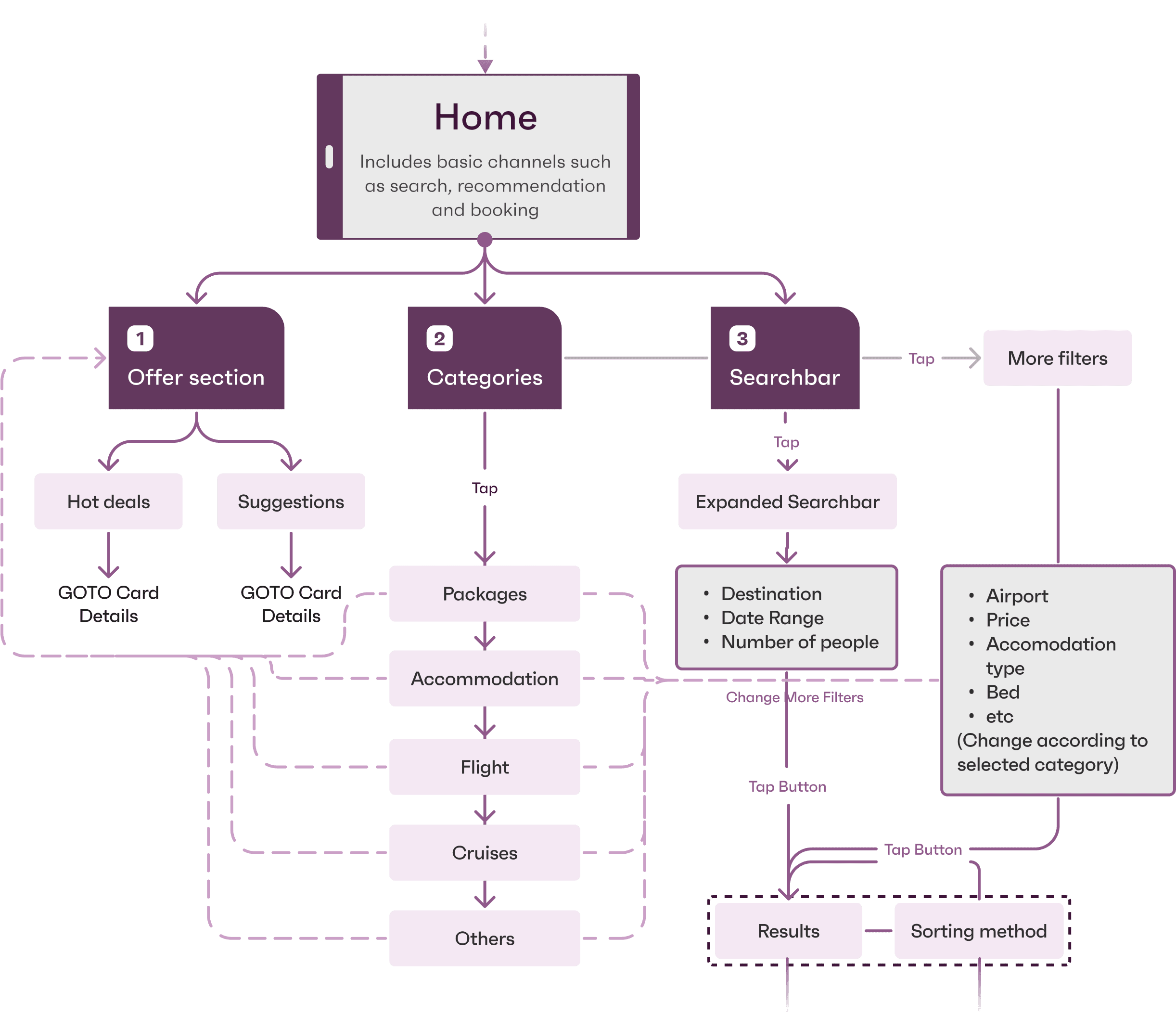
Home Page
Our Home section contains offer section, which includes hot deals and suggestions for travel recommendations. It’s also possible to select directly by travel categories in the search bar.
Searchbar
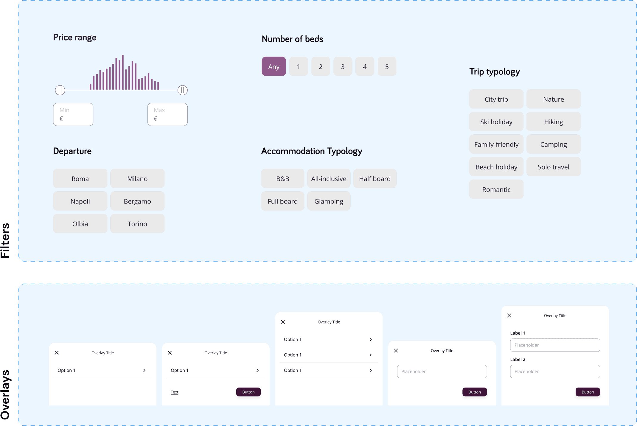
In the search bar, we placed the date range selection and the number of traveler selection. In the search bar is possible to access the filters which change according to the selected category.
We changed the name of the poorly understood “Holiday” category to “Packages”, which stands for an offer of accommodation + flight.
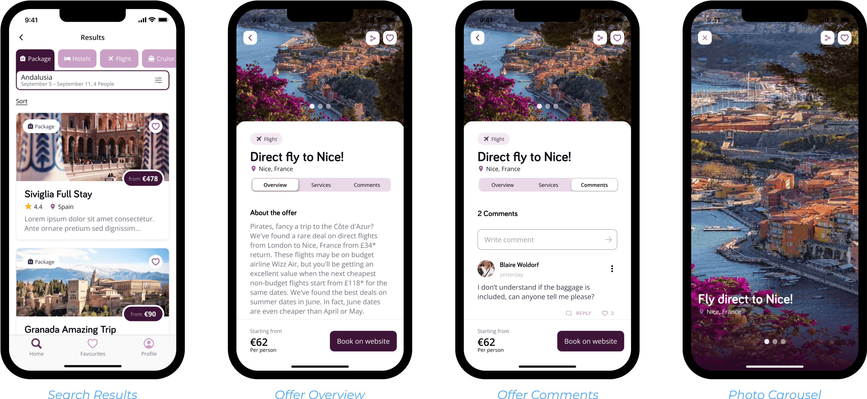
For the search results, we added the option to sort the offer cards by specific orders.
We improved the information hierarchy on the offers page.
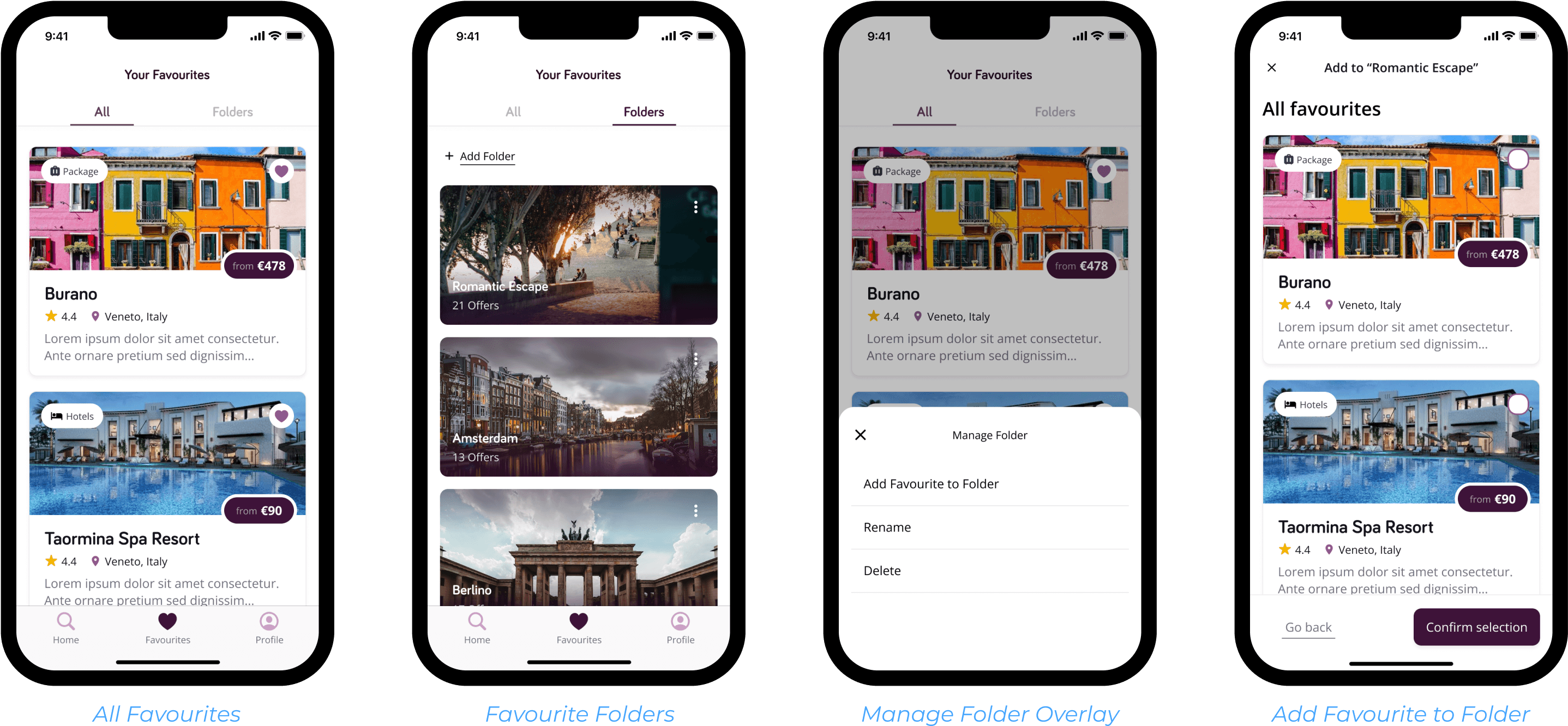
We added the possibility to create folders to group saved offers.
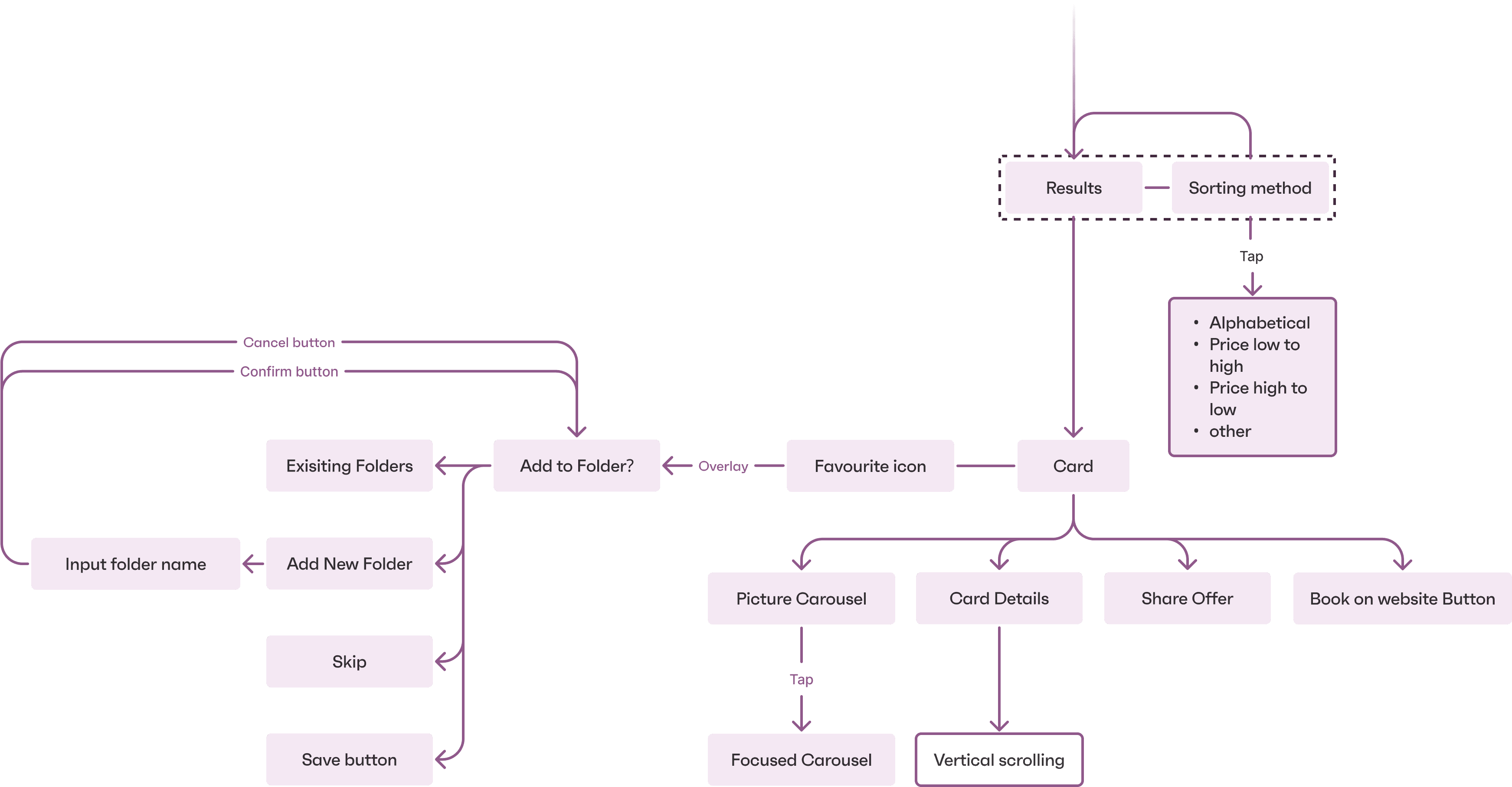
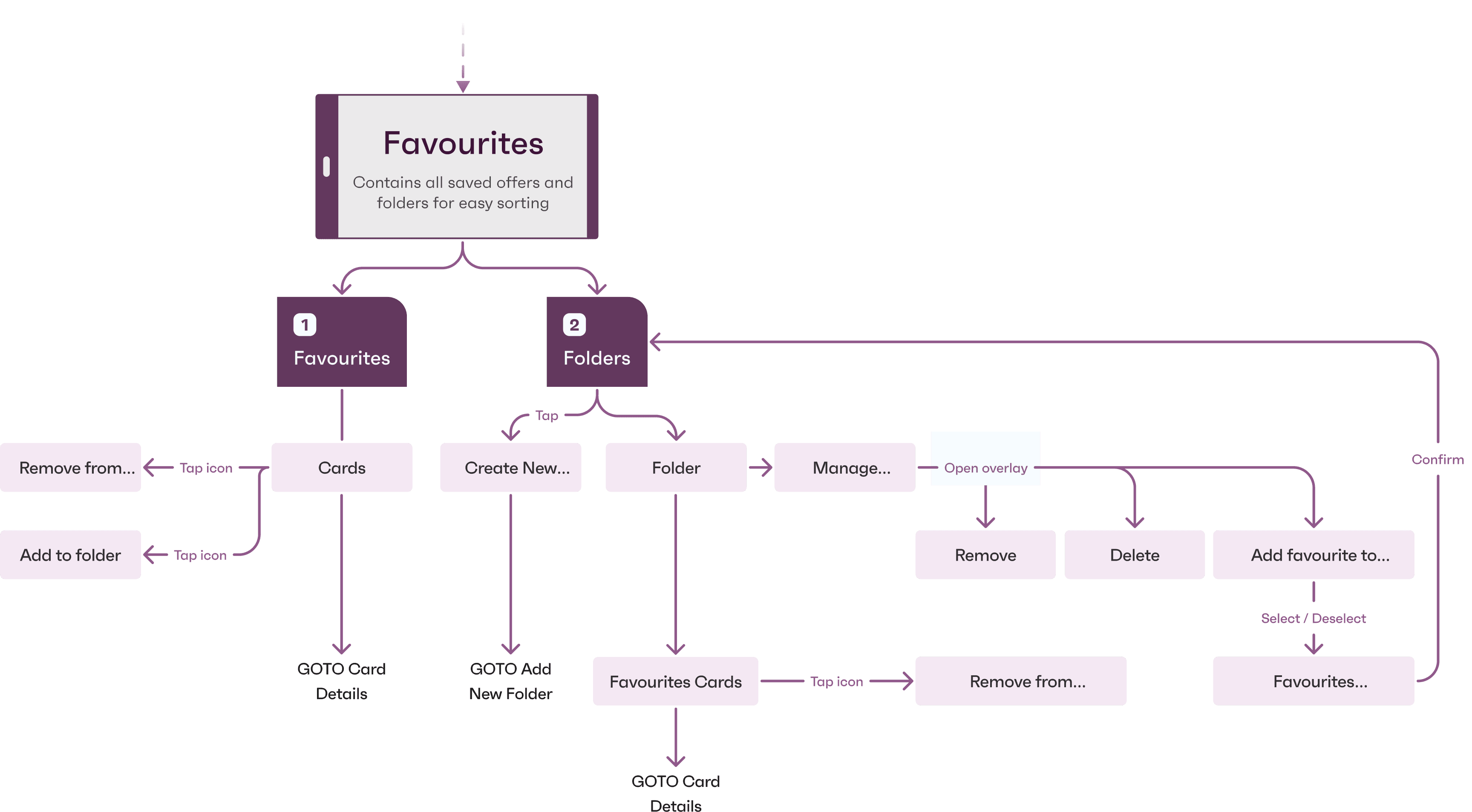
Favourites Page
Favourites are divided into two tabs, the first containing all the offer cards and the second containing folders, which the user can create according to their preferences. Offers can be easily managed, added and deleted from the folders.
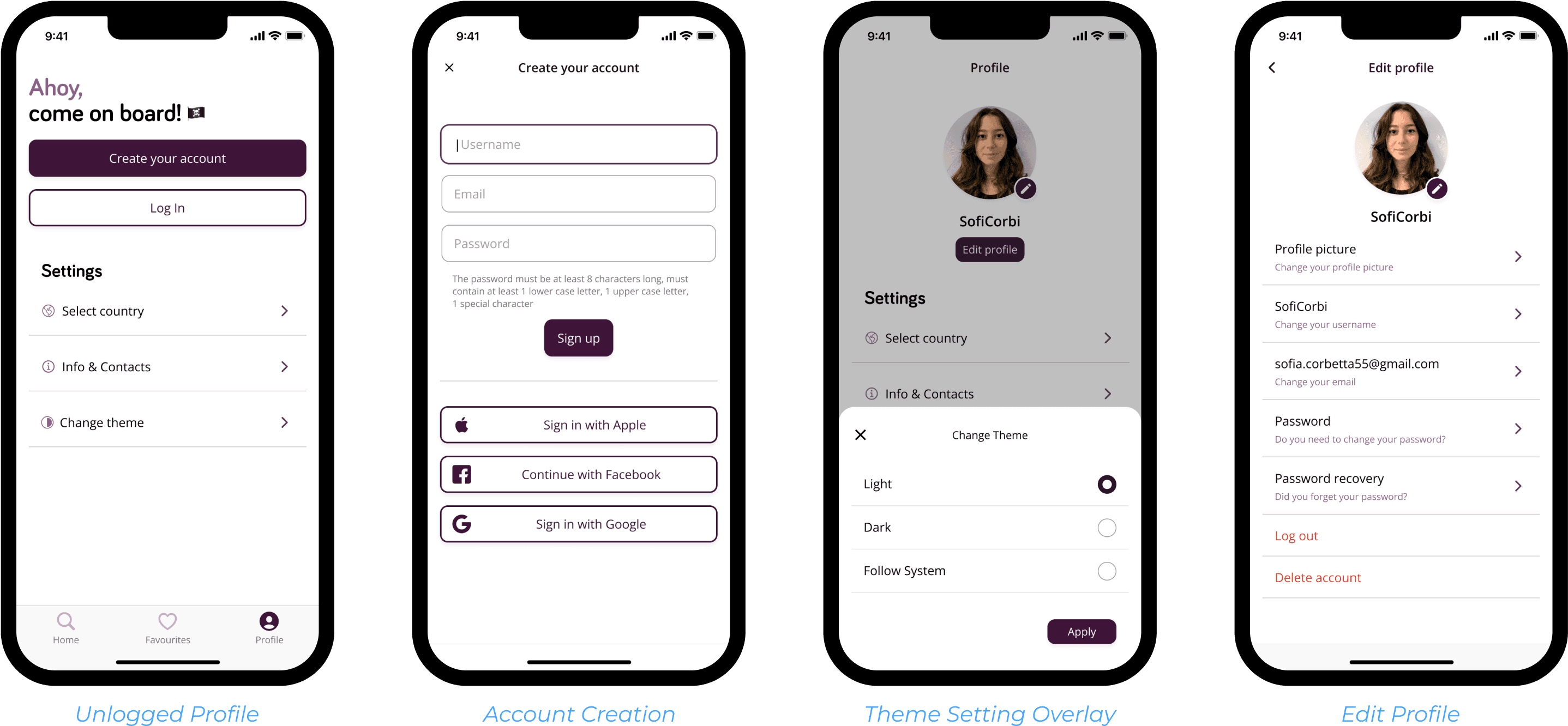
Profile Page
For the Profile section, we modified the structure to be divided into an Account section and a Settings section. In the Account section you can change photos, account content, etc. The Settings section allows you to choose your country, contacts and themes.
Wireframing
Design method
Figma
Following the Information Architecture we designed a low fidelity representation of each screen of the application, using components to map out repeating elements first.
Figma Prototyping
Using the prototype function of Figma we connected the different screens following the Information Architecture, in a way that our tester could navigate the application fully

Wireframe testing
Maze Task set-up
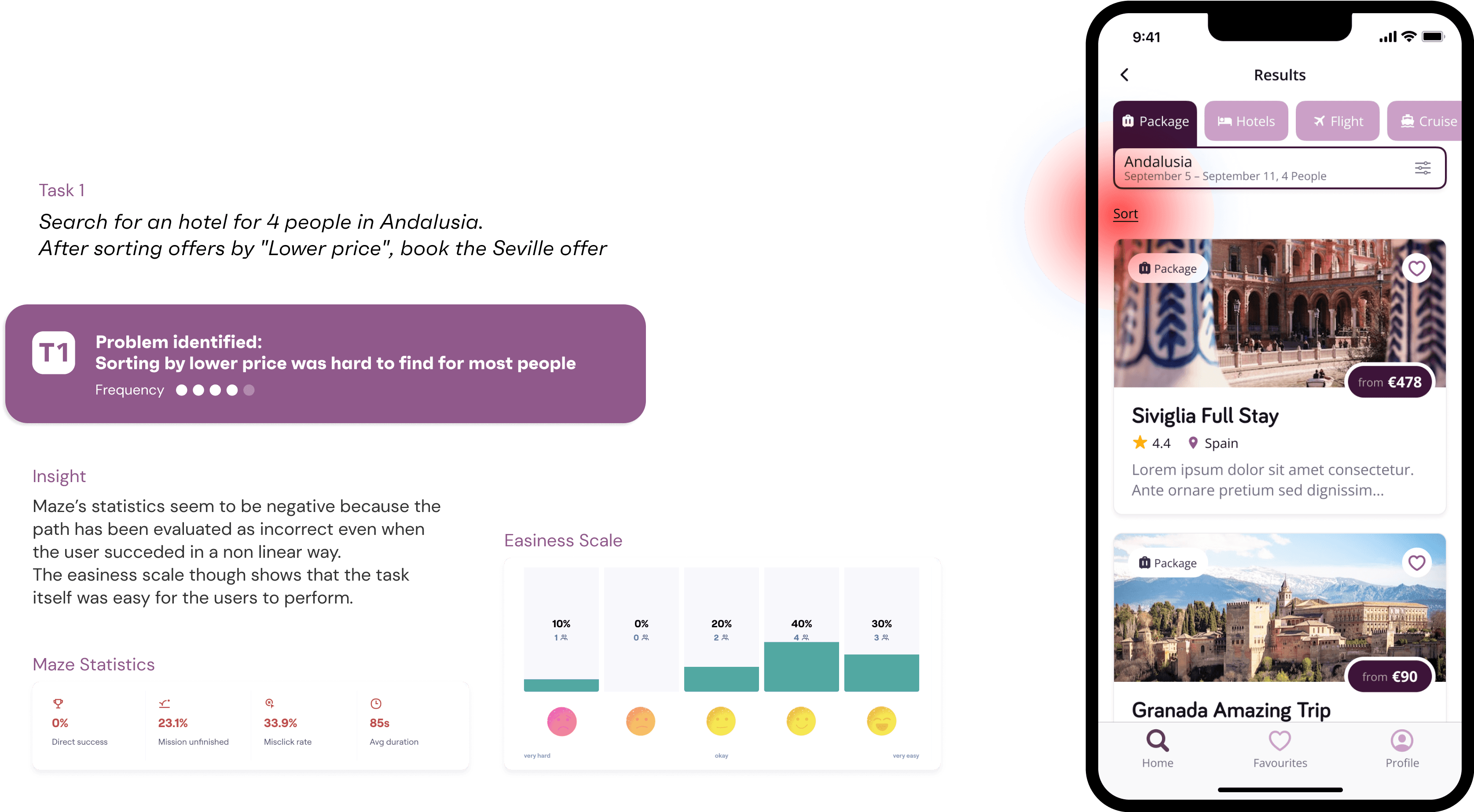
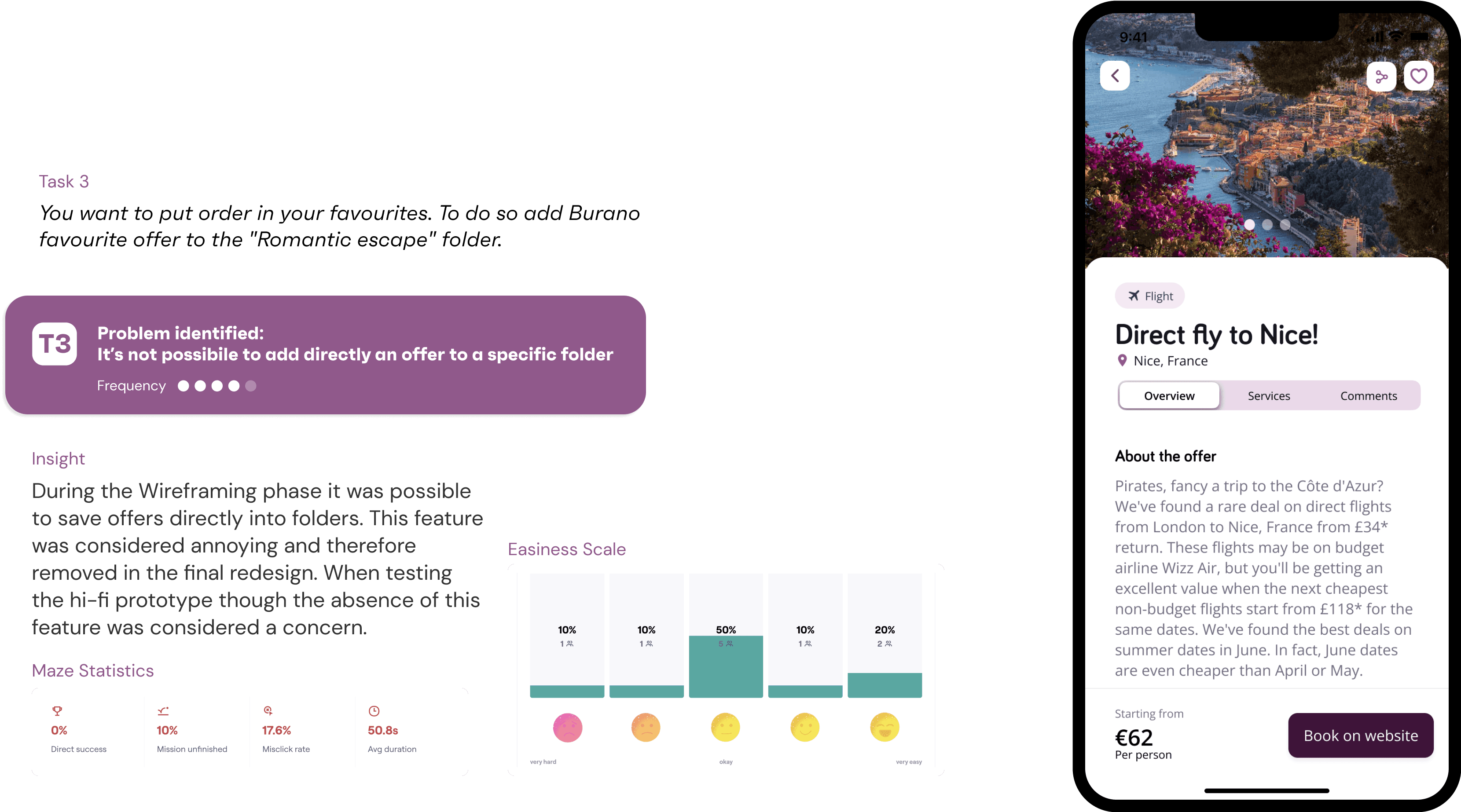
Following the same tasks used for the Tree Testing, we set-up Maze to allow users to test the main function of our prototype.
This was crucial for us to understand problems related to the app navigation and naming of section/buttons.


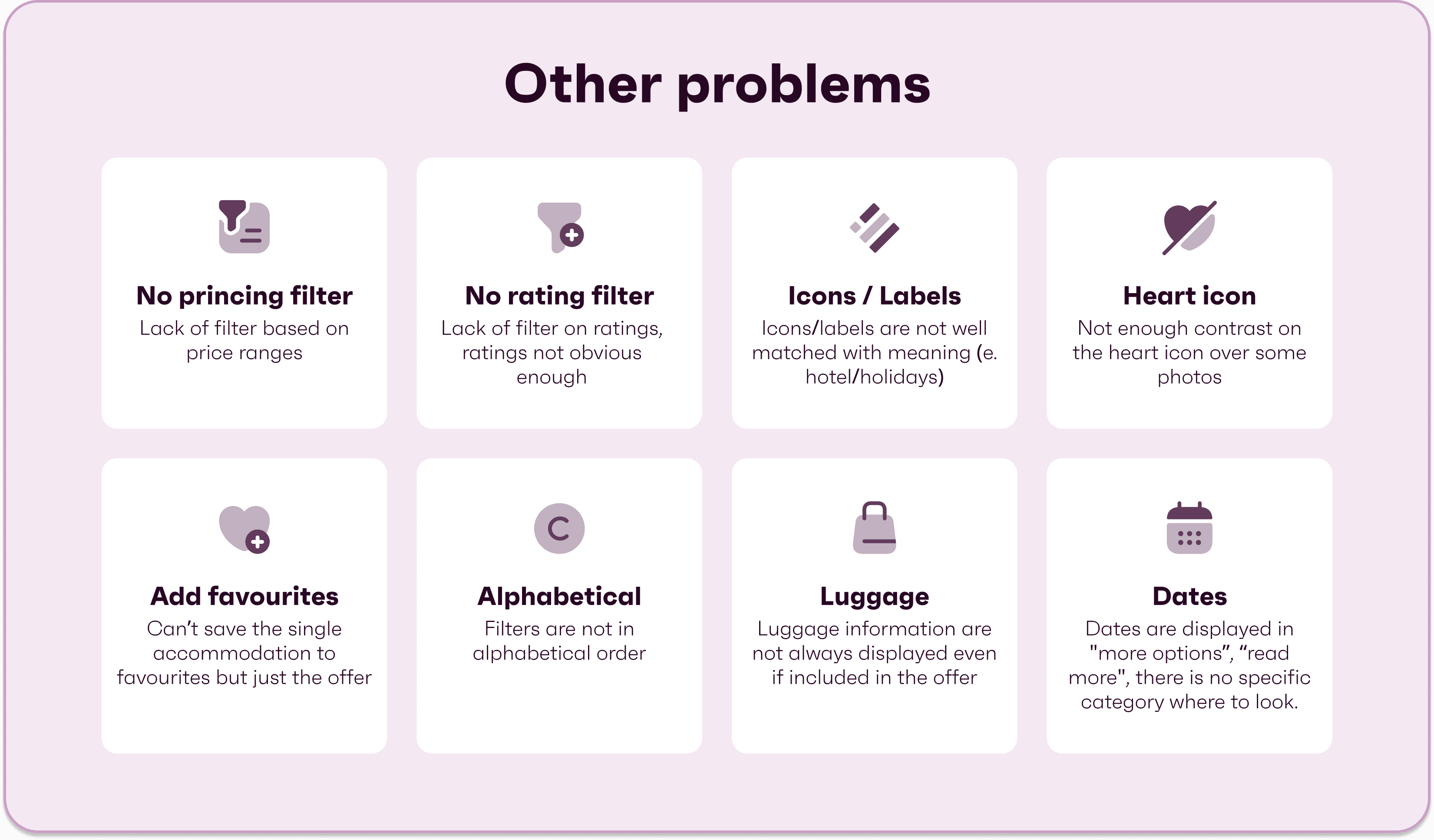
Detected Problems

High Fidelity Mockups
Design system
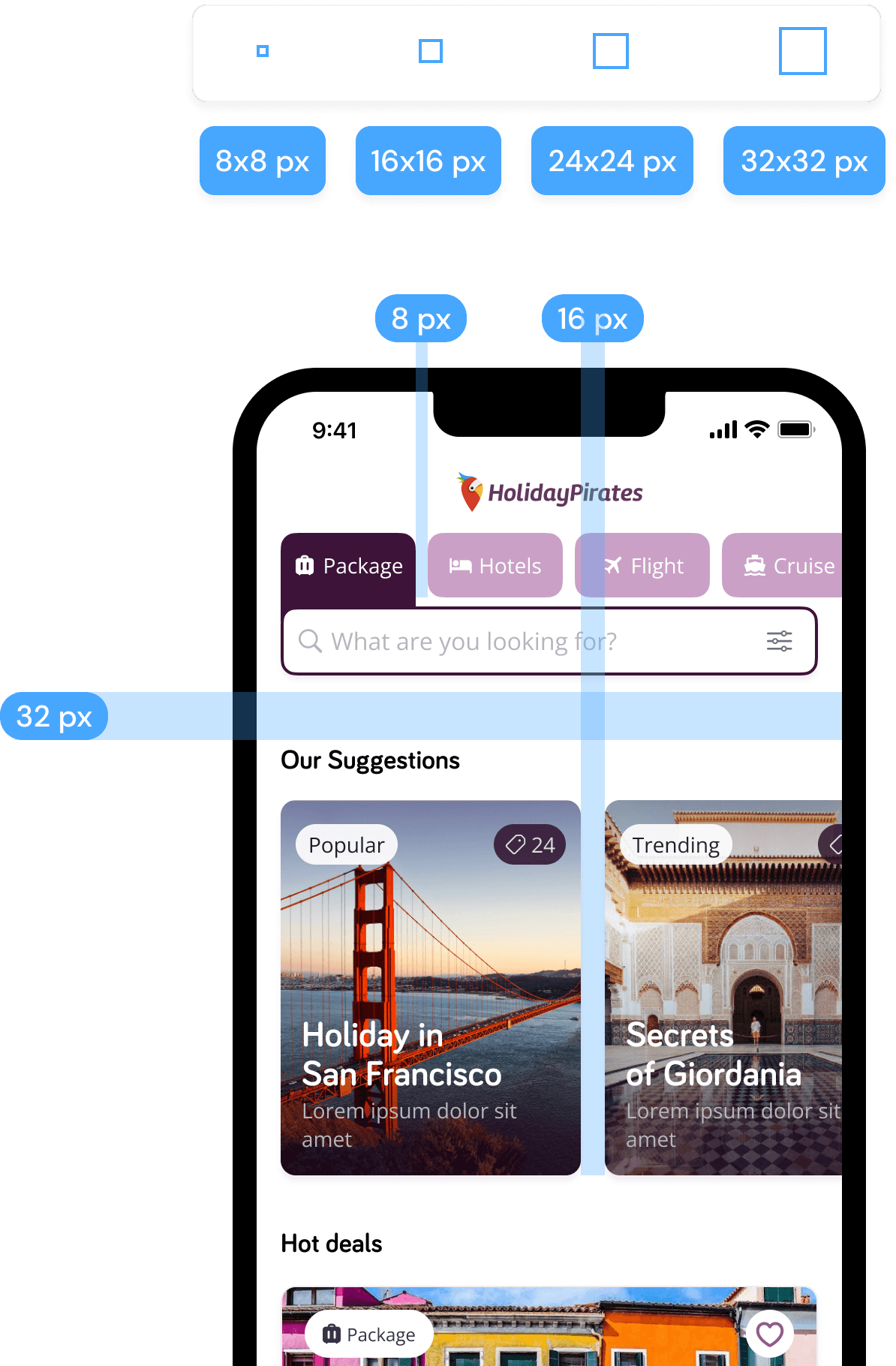
Basic Grid
We used the basic grid to allow safe and appropriate distance between elements. This determined the location of elements in the iOS system.
Spacing
We used these spacings to separate elements from each other inside the system.

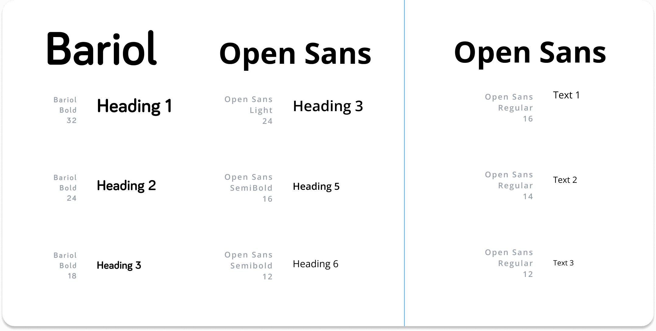
Typography
For the headings we chose two fonts. The first one “Bariol” is the main font from HolidayPirates’ visual Identity, and it’s used for major headings. The second one “Open Sans” was used for minor headings. For the paragraphs we used “Open Sans” with three font size variants.
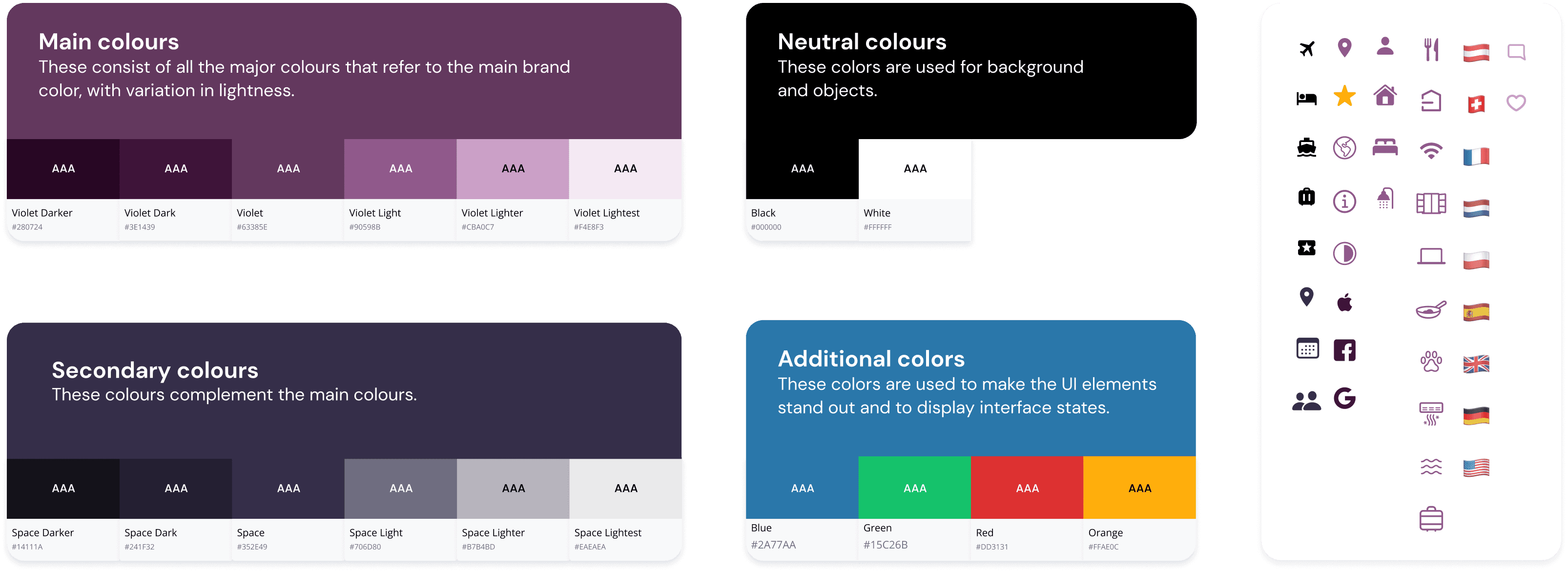
Colors & Icons
Navigational Components & Containers
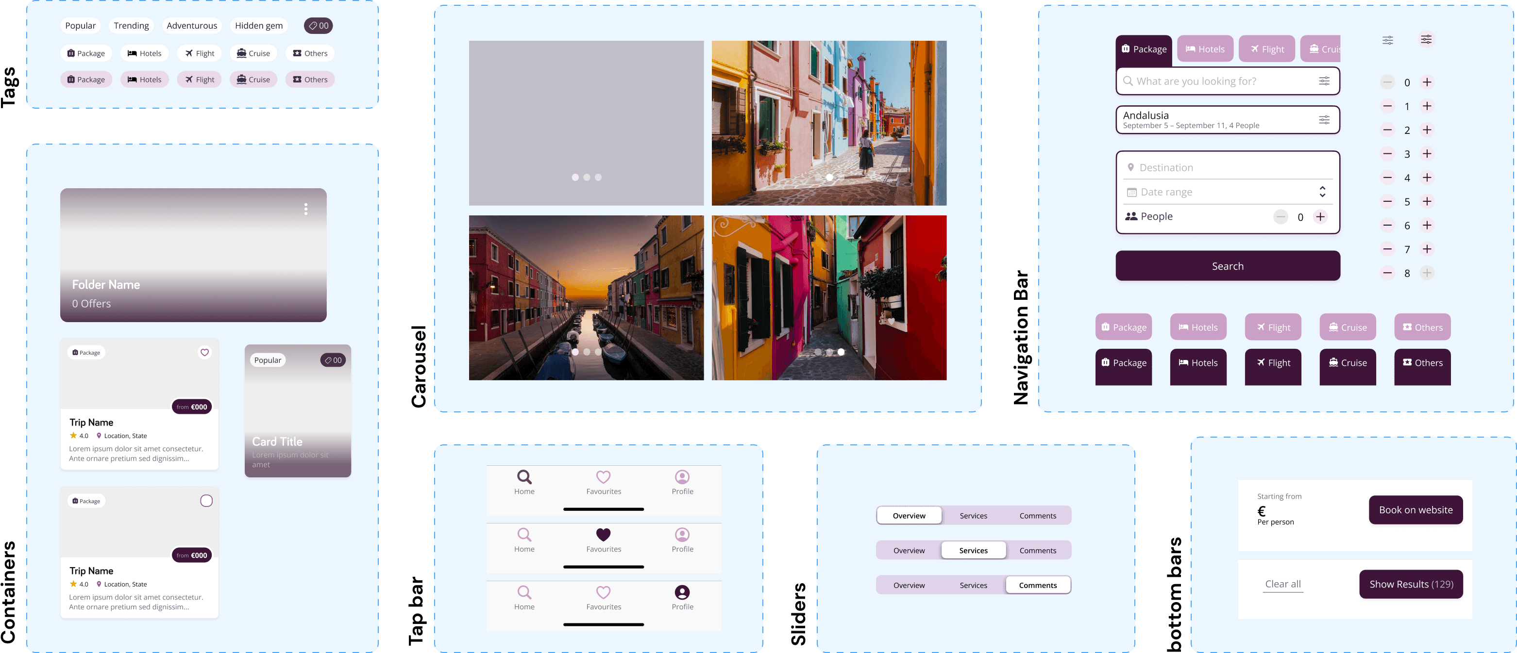
Input Controls

Qualitative Mockup Testing
Two mockups were created for each of the main screens: home and offer details.
Semi-structured interview among designers, in order to have feedbacks and possible solutions.

Insights
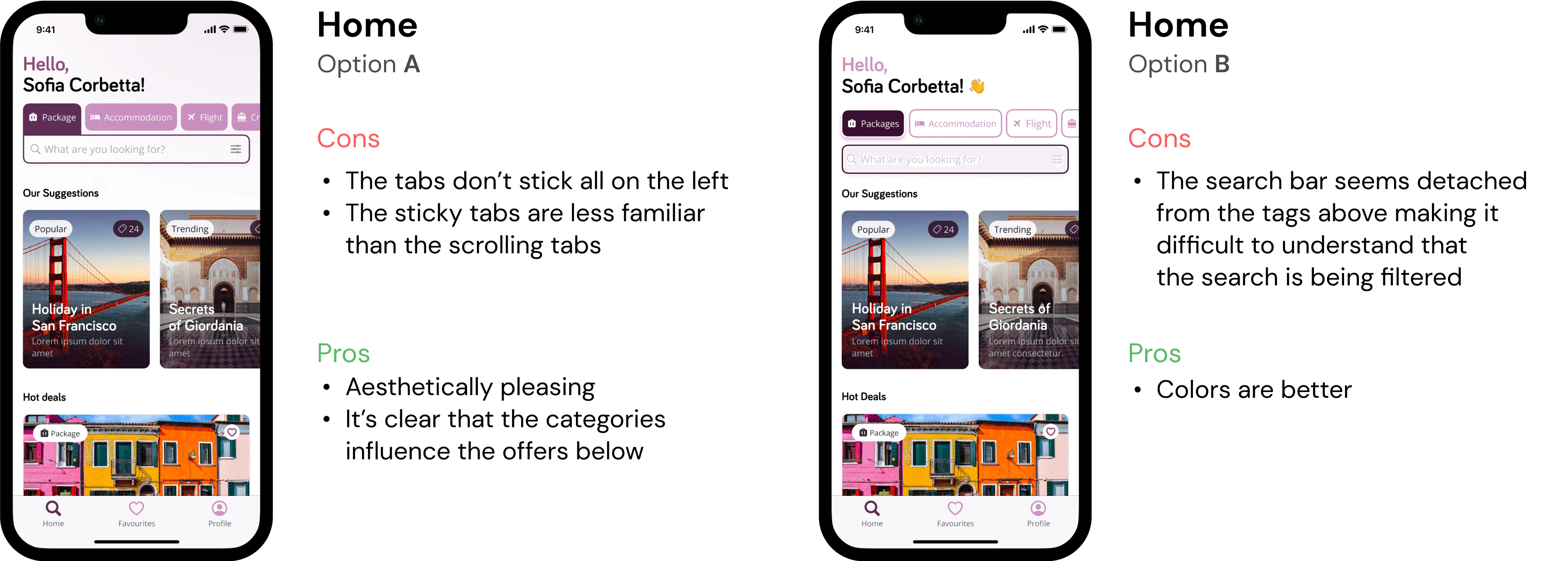

Quantitative Mockup Testing
The semi-structured interview didn’t show a clear preference between the two offer details screens.
Thus, a two-option questionnaire was posted on social media to understand people’s opinion towards those screens.
Thanks to the large amount of people voting (118 people), the results showed a clear preference towards option B.
This was probably due to more organised clusters of information through the use of tabs.

Final Mockups
Home
Offers
Favourites
Profile
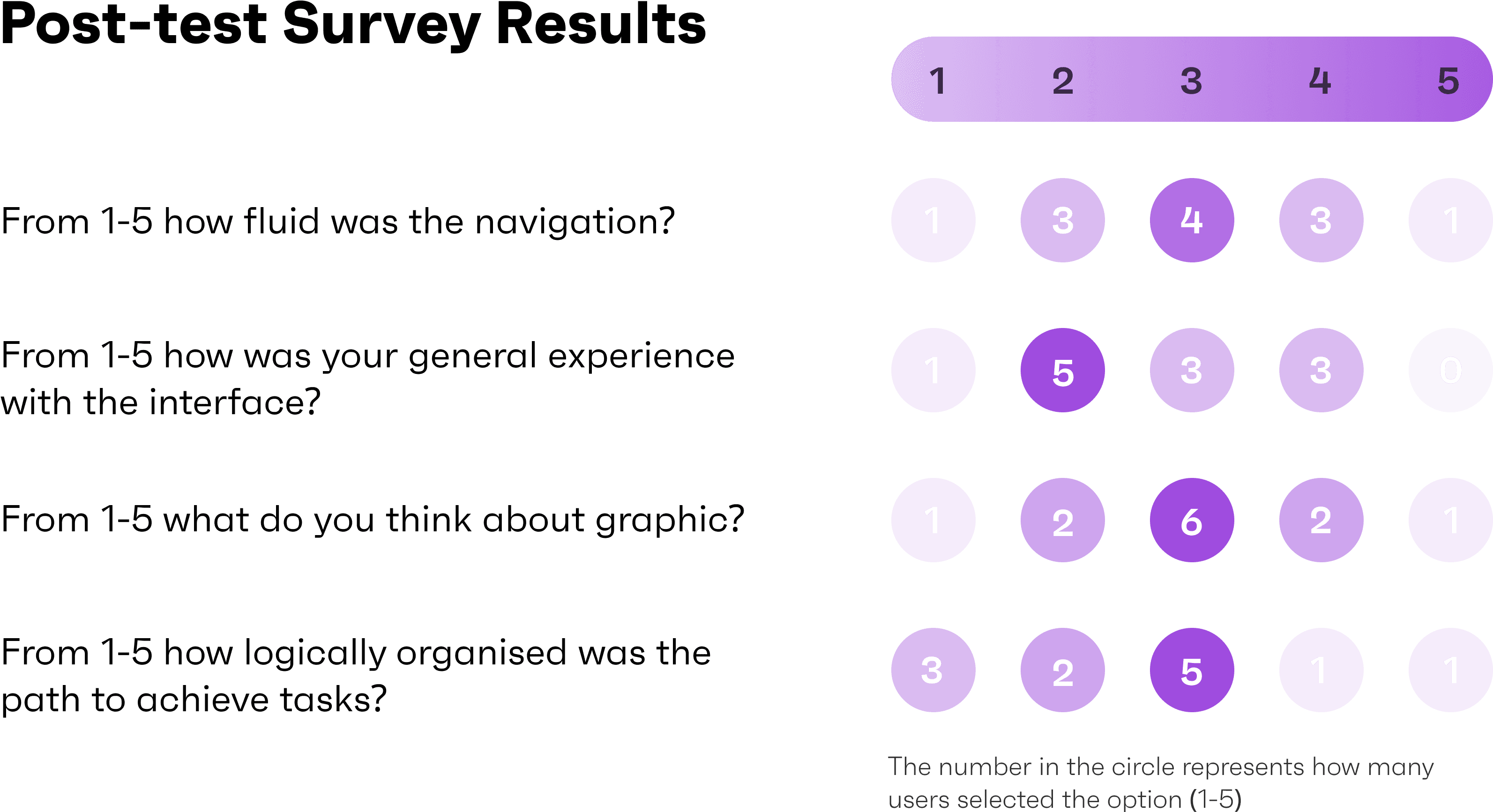
High-Fidelity Testing
Maze Task set-up
As for the previous testing, we used Maze to set-up tasks for the user to test.
This time we decided to reduce the number of tasks and make them more complex to allow the user to discover different type of interaction and also to understand if the app paths were working as intended.
We accompanied the tasks with easiness scale questions to understand the user’s opinion.